Streamlining Swimming Bookings: Elevating user engagement with Two Key Steps
A Personal Concept Redesign of a Real World Leisure Centre App
UX Research
UX Design
UI Design
Everyone Active is one of the leading leisure centre chains in the UK, who encourages activity bookings through their mobile app.
As a regular user of the app, I noticed it had some serious usability issues—it was often confusing to navigate and could be quite frustrating to use. After chatting with other users, I found that many actually preferred calling the reception desk over using the app, which really highlighted how much improvement was needed. That got me thinking: what if I redesigned it with a better user experience in mind? I decided to take it on as a personal side project, focusing on the swimming section. It's an area I'm familiar with, and it gave me a solid chunk of work to dive into without trying to tackle the whole app at once.
After talking to users and conducting research, I discovered widespread usability issues:
These issues led to fewer people using the app, which meant staff had to step in more often—whether at the reception desk or over the phone. This not only added to their workload but also worked against the goal of encouraging more users to rely on the app and easing pressure on the team.
This is a personal design concept created for educational and portfolio purposes only. I'm not affiliated with Everyone Active, and all screenshots of the original app are used solely for critique and improvement demonstration. All design decisions were made using UX principles and reasonable assumptions, without access to internal data.
The user base ranges from 16 to 80 years old, spanning a wide demographic of individuals who value physical activity.
UX Audit
I began this project by conducting a UX audit of the app, identifying pain points and areas of friction in the user experience.
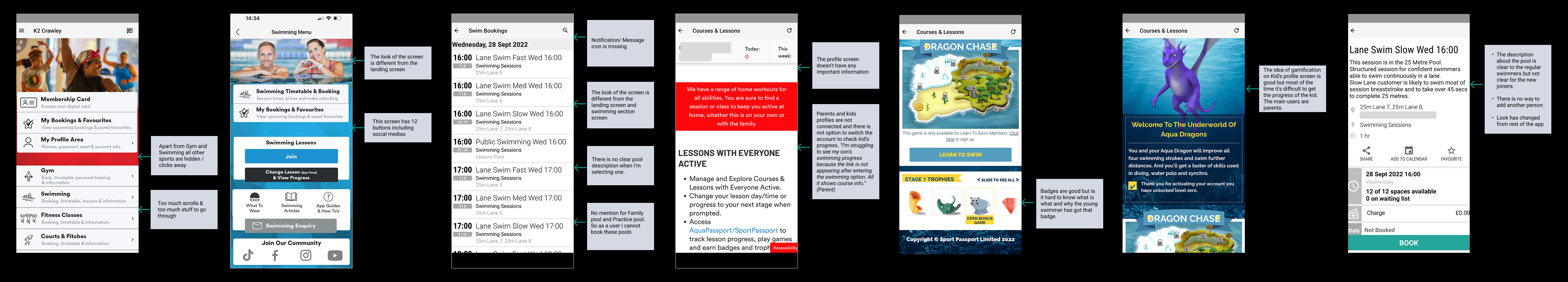
Key Issues Identified in the Audit:
Screens lack visual and structural consistency
Excessive clicks are required to complete simple tasks
No clear way to book the "Practice Pool"
The profile page offers limited value
Parents are unable to access their child's account from their own profile
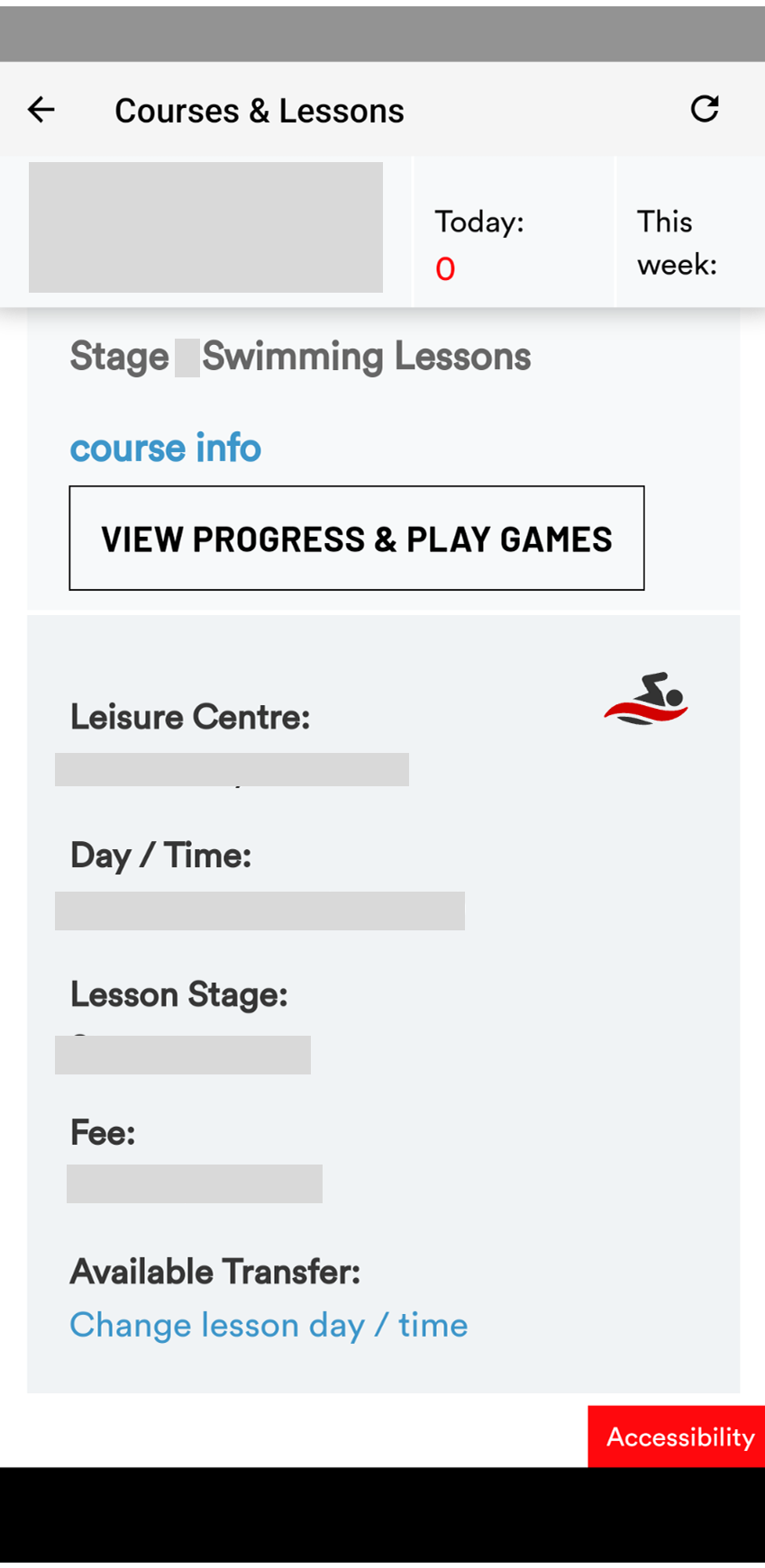
The Kids' Progress section displays games and badges with cartoon images, but there's no explanation for why a badge was awarded
Usability Testing
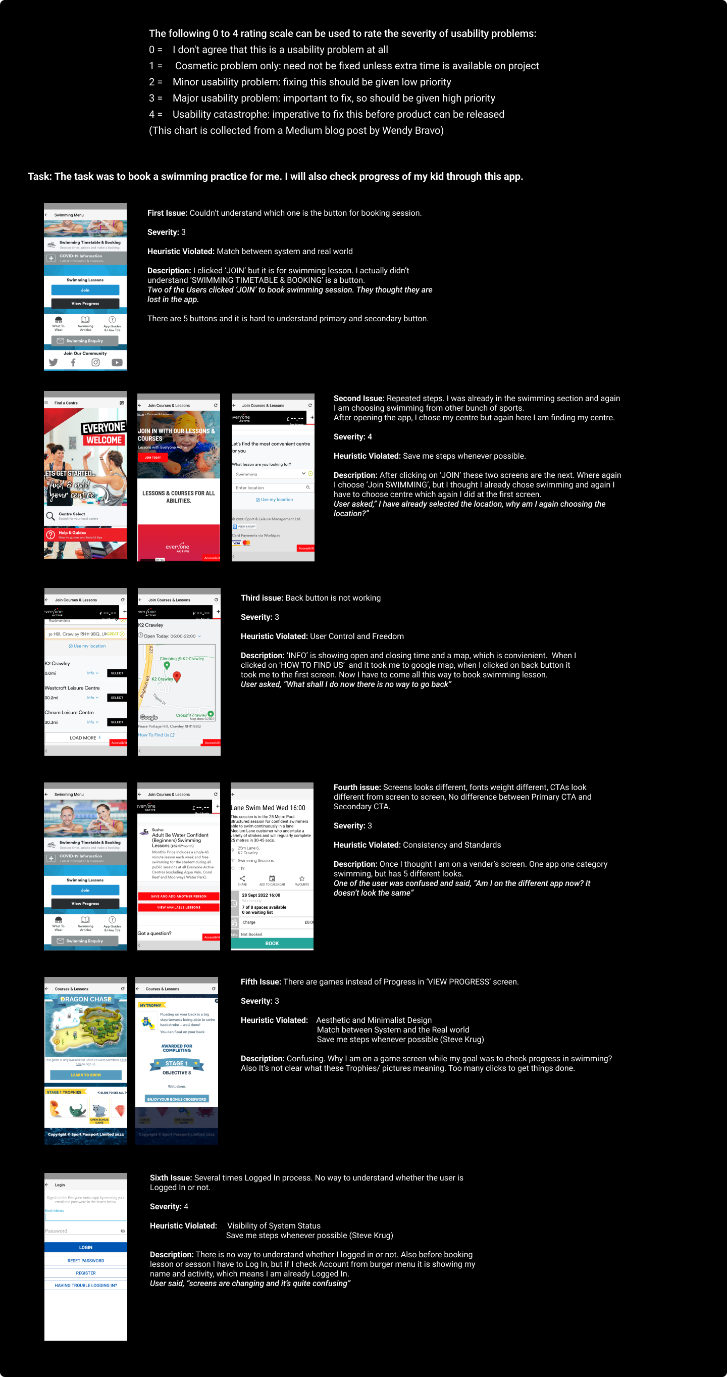
To explore these issues further, I conducted usability tests with five potential users and had conversations with a few real users of the app.
Tasks Given:
Book a family pool session for four people
Access and review a child's profile page
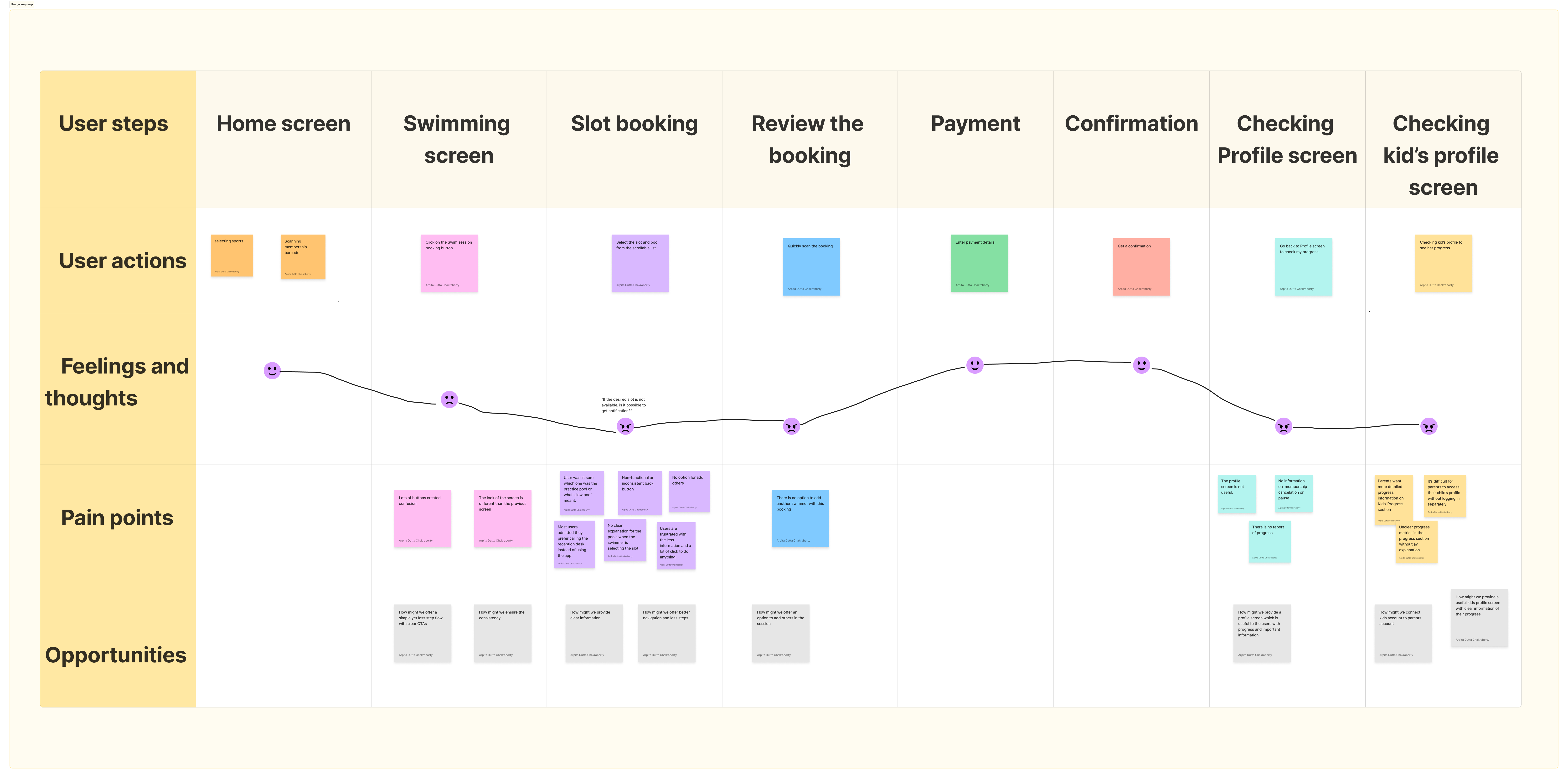
Key Insights:
Users struggled to add multiple swimmers during booking
While they liked the Kids' Progress section visually, they wanted more detailed progress information
It was difficult for parents to access their child's profile without logging in separately
Most users admitted they prefer calling the reception desk instead of using the app
Secondary Research- App Store Review Analysis
I also reviewed App Store feedback to understand common complaints and user expectations. Interestingly, the themes from the reviews closely aligned with my usability findings — highlighting the same core usability gaps.
Heuristic Evaluation
A heuristic evaluation revealed additional usability issues, such as:
Repetitive steps throughout the booking flow
Non-functional or inconsistent back button
Inconsistent design elements across screens
Overcrowded screens (more than 4 buttons per screen)
Unclear progress metrics in the progress section
Users want a simpler booking flow with fewer steps and clear CTAs.
Consistency across UI elements improves user confidence and ease of use.
Clear, jargon-free information helps users make faster decisions.
Users prefer intuitive navigation with minimal effort.
Users expect an easy way to add others during the booking process.
A personalized profile with progress and key info increases engagement.
Parents want to link and manage their kids' accounts easily.
Users need a dedicated kids' profile showing progress and session details.
To synthesize all research findings, I created a user journey map. This helped me identify clear opportunity areas and prioritize where design improvements could make the most impact.
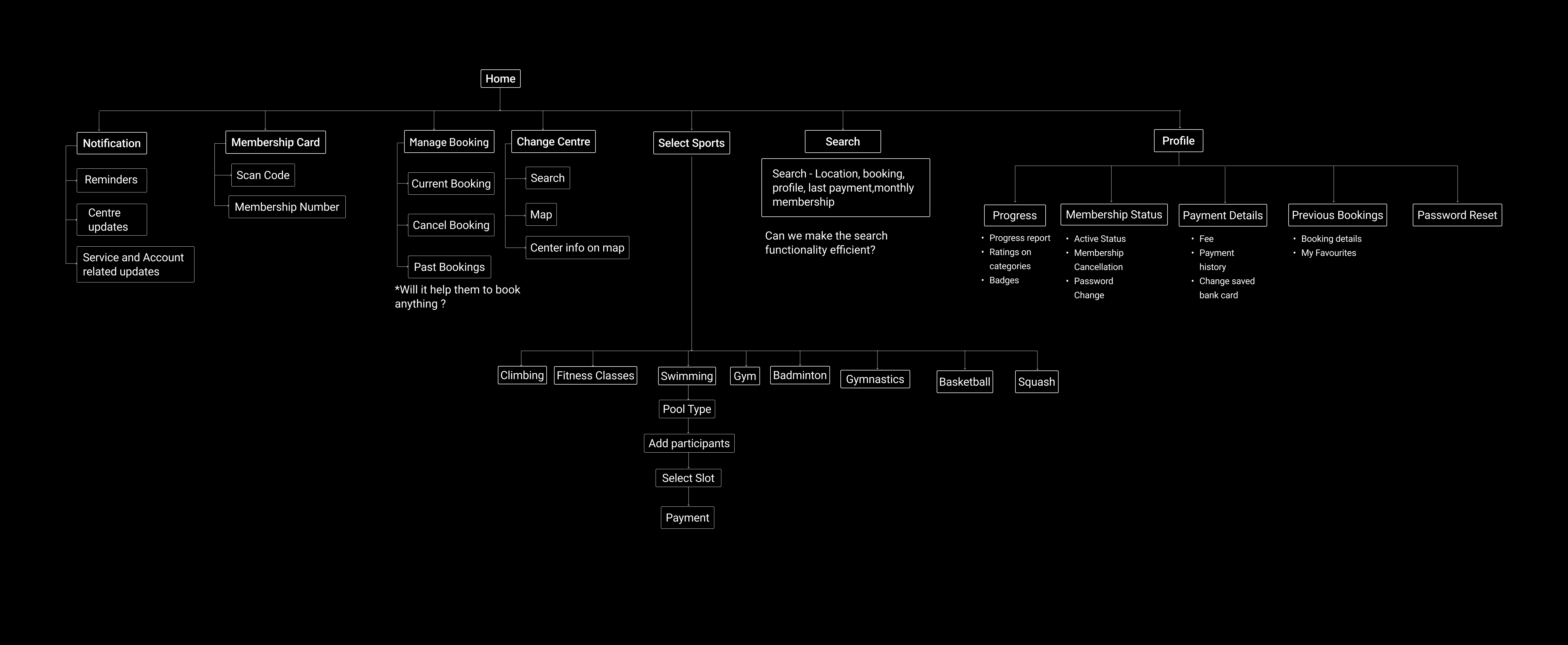
To reimagine the experience, I first mapped the app's Information Architecture to better understand how tasks and content were organized. For instance, I noticed the “Profile” section was underutilized. I proposed evolving it into a central hub for tracking user progress, accessing personal details, and managing bookings — making it far more purposeful and user-centric.
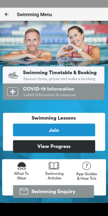
The original app is huge and complex, so I’m only focusing on a few main flows in the swimming section where I found most of the issues.
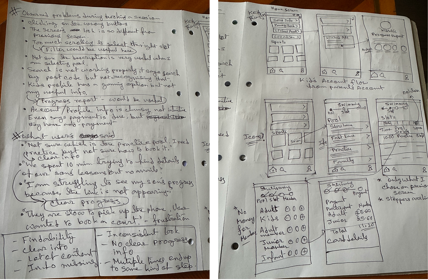
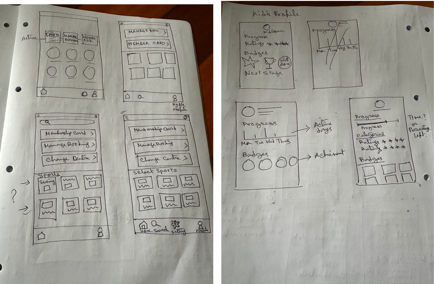
My messy notes
Before I designed the final screens I wanted see the user flow. This exercise helped my decision on what screens I needed and how the flow is going to be.
My Concept Design
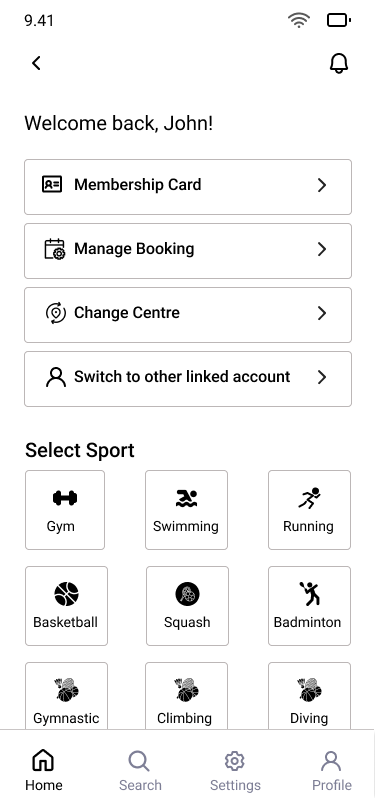
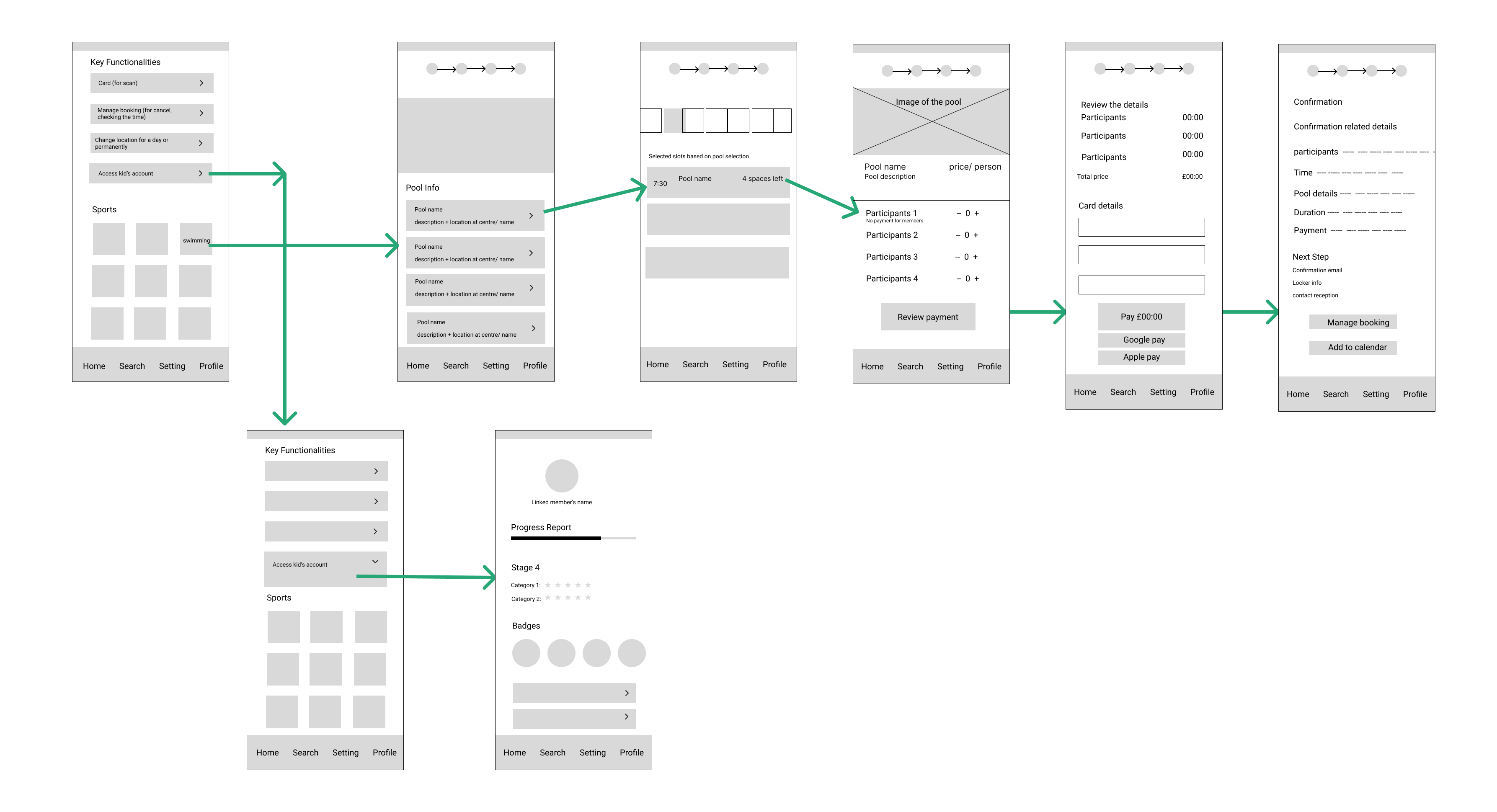
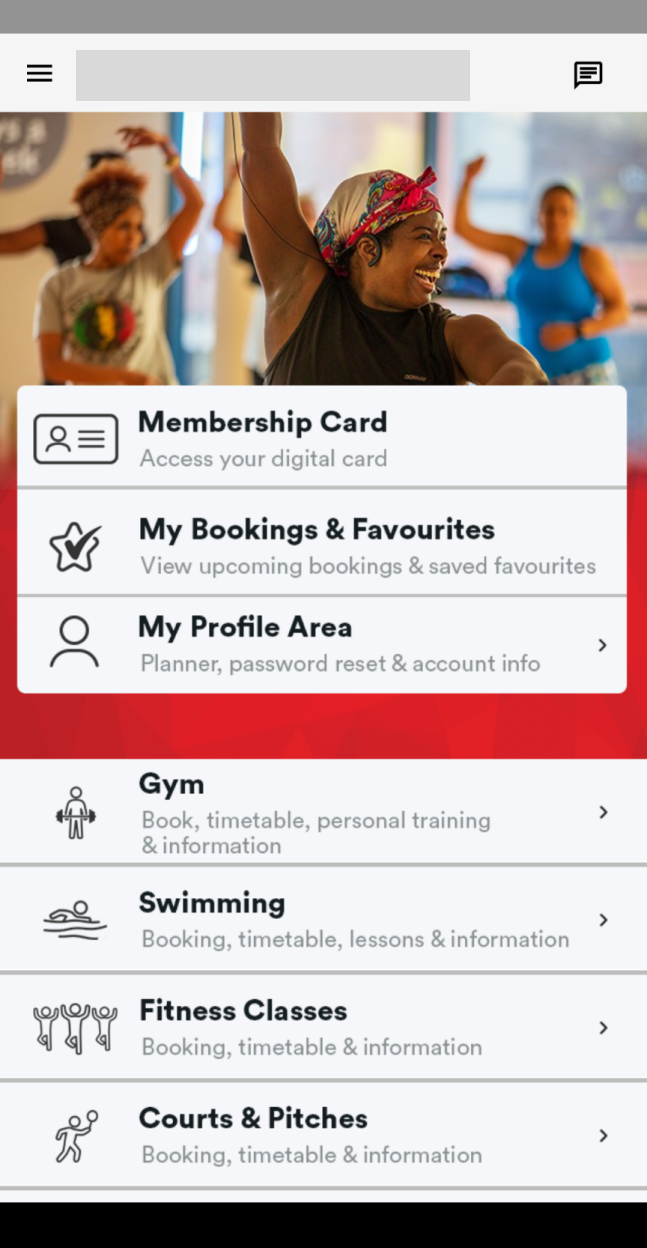
My goal was to simplify the process and reimagine the flow to create an intuitive experience for the users. With this in mind, I redesigned a unified home screen where users can find all the key functionalities like membership card details, manage booking, location change and access all available sports. This way users are going to be focused on the goal they want to achieve.
Original Screen
My Concept Design
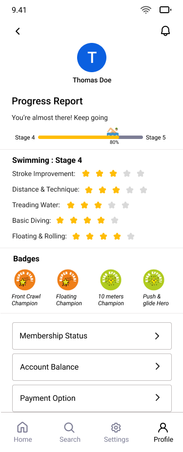
Swimmers want to track their progress and earn badges for inspiration. To support this, I added growth-related information to their profile page, along with account-related details such as Membership Information, Membership Cancellation, and Payment History for easier access.
Original Screen
My Concept Design
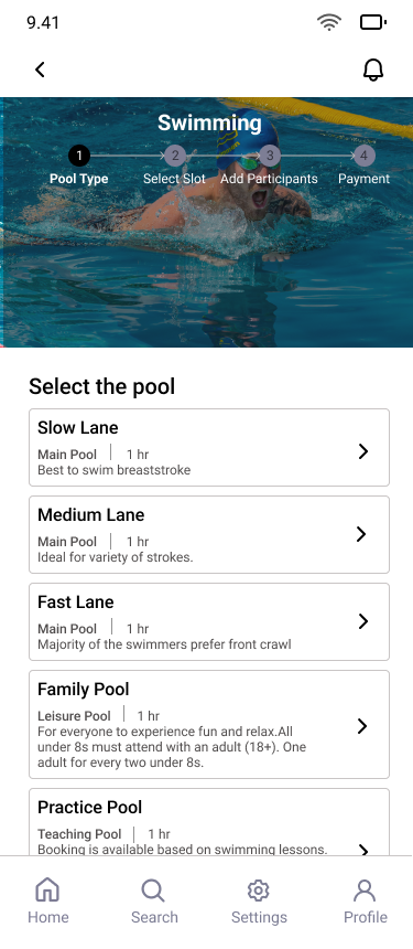
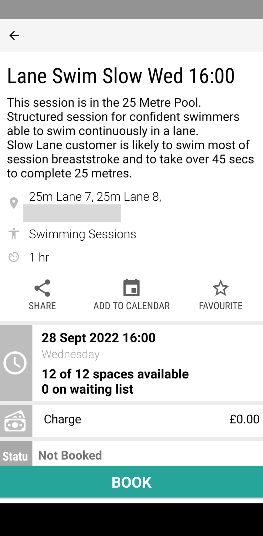
In my concept design, I added a step for selecting the pool to help users make an informed decision, since my research showed that swimmers were often confused by the pool descriptions. In the original app, however, pool-specific information only becomes available after a pool is selected on the booking review screen.
Original Screen(During Booking)
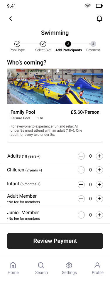
There was no clear way to add another member or non-member to a session. I streamlined the add-a-member in the booking flow, and clarified pricing changes based on membership status. This concept can provide more clarity to the users.
A child under 8 years of age cannot use the the pool by themselves and need to be supervised by and adult while using the pool. This screen will help the members to book the sessions together instead of going via 2 separate booking process.
As part of this personal project, I conducted usability testing with a small group of friends to gather feedback on the prototype. Based on their insights, I implemented several refinements to improve clarity and user experience. For example, changing "Switch Account" to "Linked Member Account" to improve clarity.
UI Label Improvements: One key change was renaming “Switch Account” to “Linked Member Account” to better reflect the feature's functionality.
Positive Flow Feedback:
Efficiency Gains: Users were able to book swimming sessions more quickly in this version.
Clarity Improvements: Testers noted that the process now feels more informative and easy to follow.
If I were part of the actual design team, I would have:
It was a valuable reminder that great design doesn't happen in a vacuum—it's about listening, adapting, and collaborating.