This challenger brand wants an intuitive app that will help them stand out from the crowd. They need a clear, trustworthy and playful UI design for a new responsive Bank application.
- Design brand identity
- Create a fresh new interface for a responsive banking application
- Design polished user interfaces for three screens on mobile, tablet and desktop
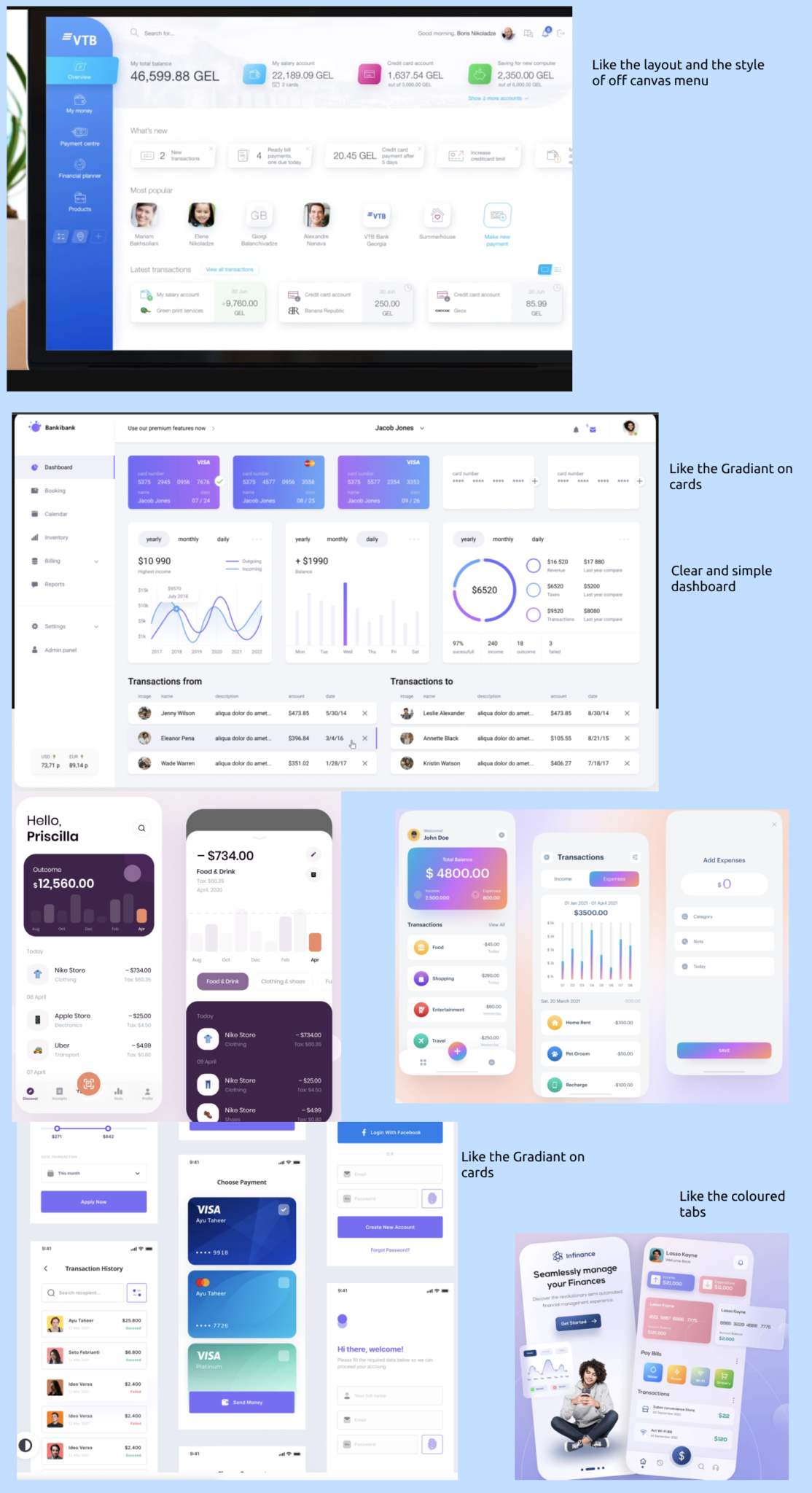
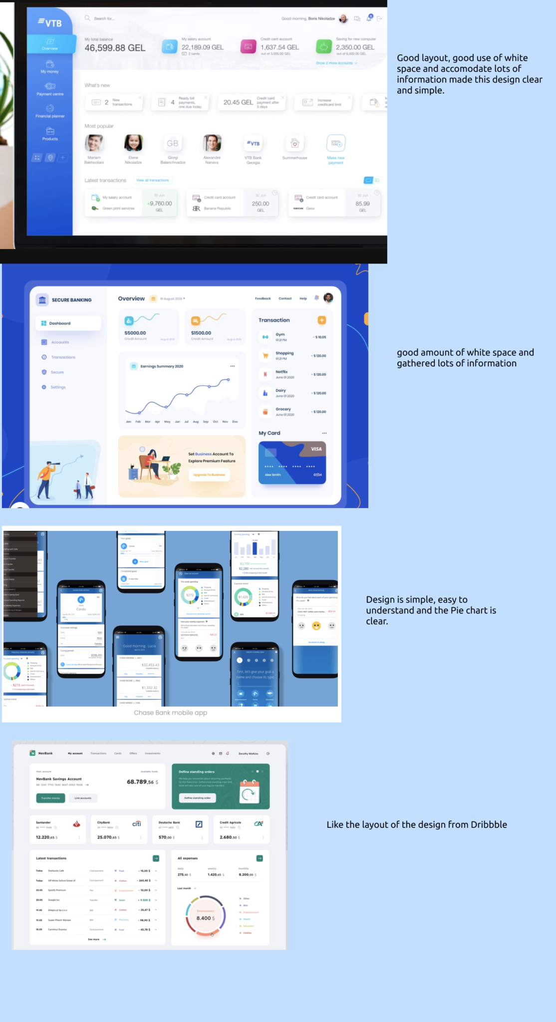
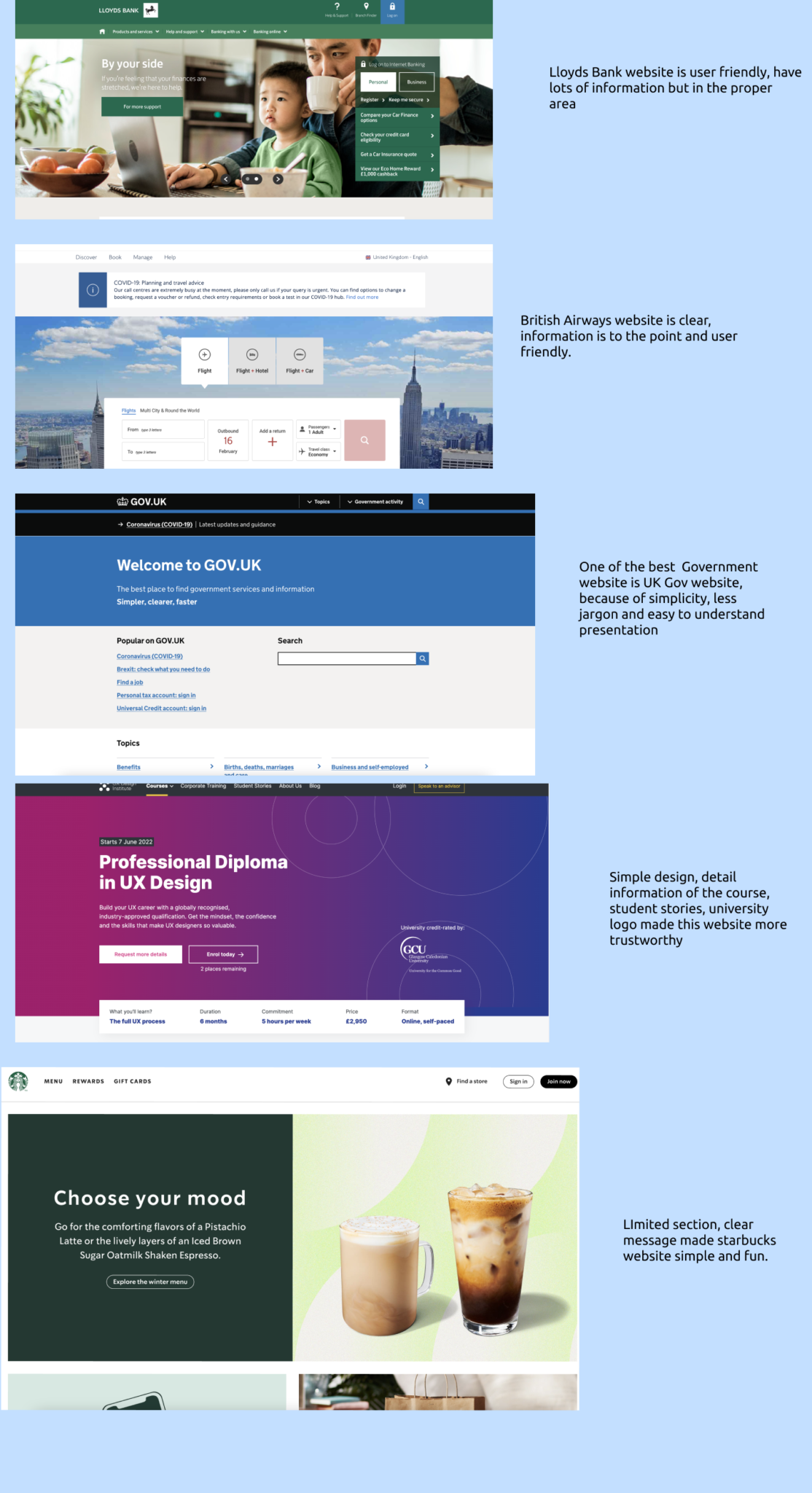
I started with collecting inspiration from popular apps and websites to understand how other companies are solving problems.
I accumulated screenshots from leading banks, popular apps and websites which maintain a clear and trustworthy design.
I created a mood board for inspiration based on brand principles: Trustworthy, Playful and Clear.
I liked gradients on the cards. Some of the screen layouts and components.
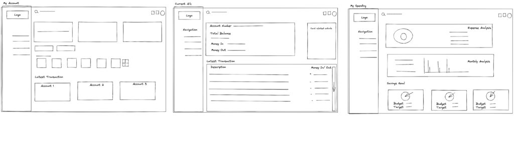
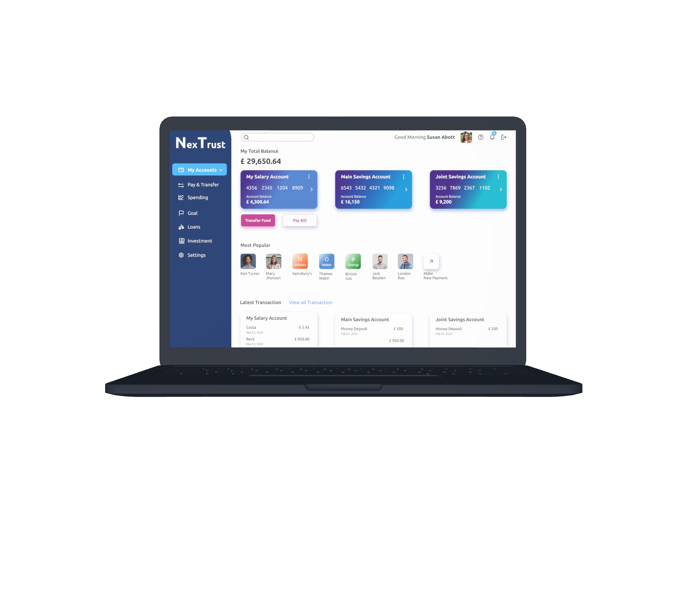
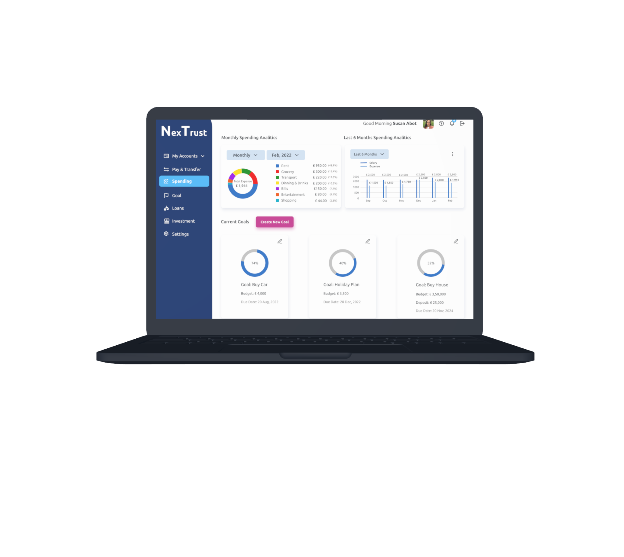
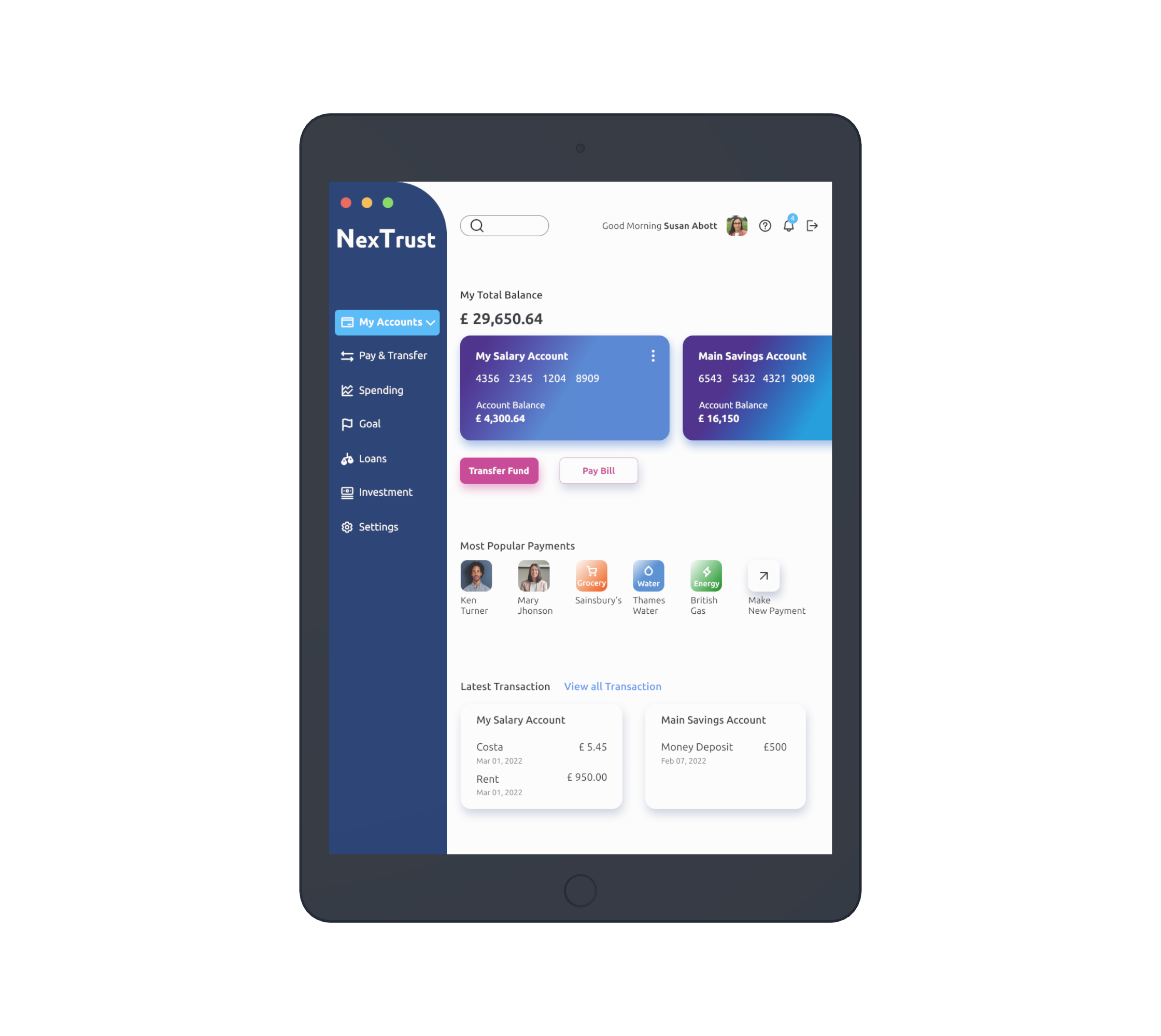
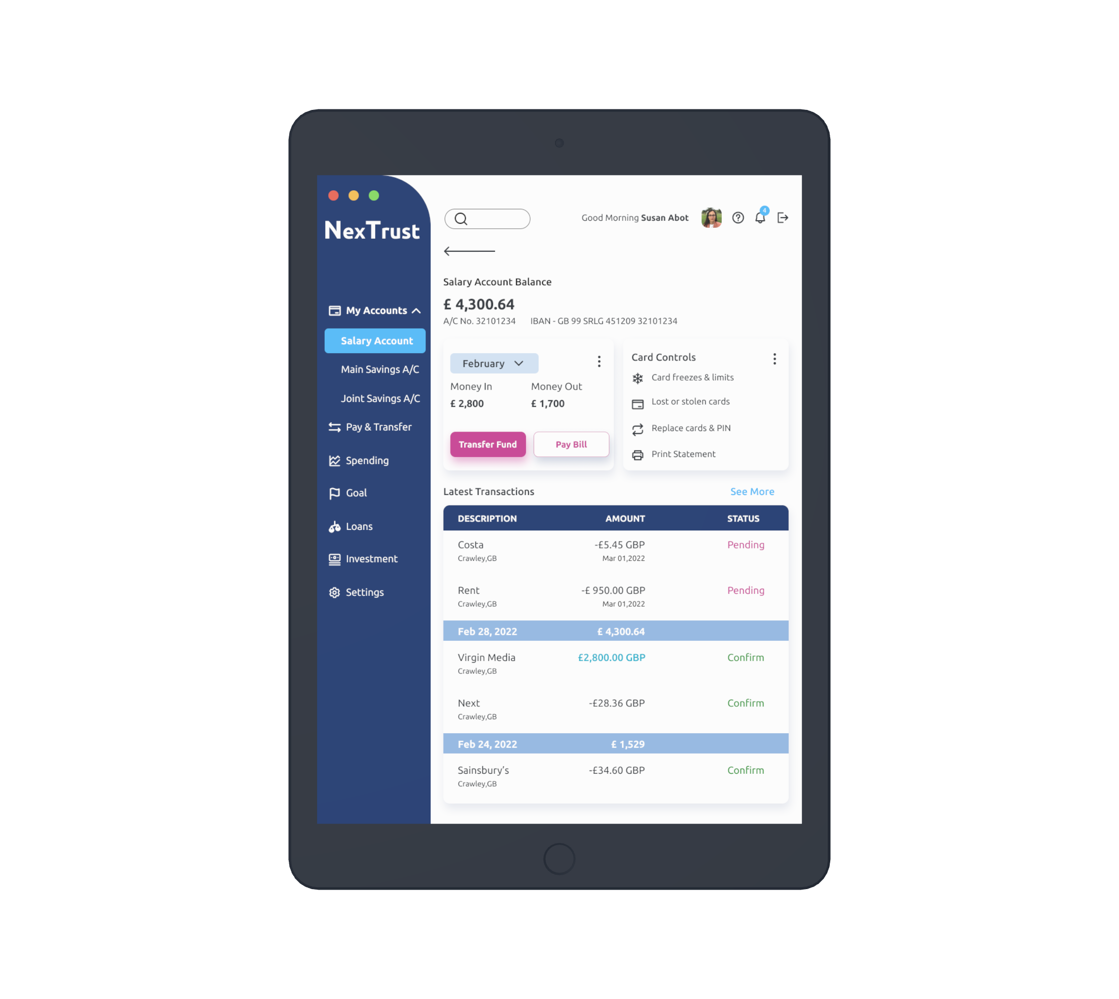
I started the project with a set of wireframes which my Institute has provided. Based on the wireframe I needed to create three screens for each device like Mobile, tablet and desktop.
Initial challenge was to find out the right features and understand how I can present the app's playfulness and trustworthiness. So I listed out some of the essential features and functionality for the banking app which I thought users would like. For this task, I did competitive analysis on the most popular banks in the UK, like Llyods, Barcleys, HSBC. I listed out what are the common features, what sections must be included and what I can leave.
Some of the must haves are,
Findings
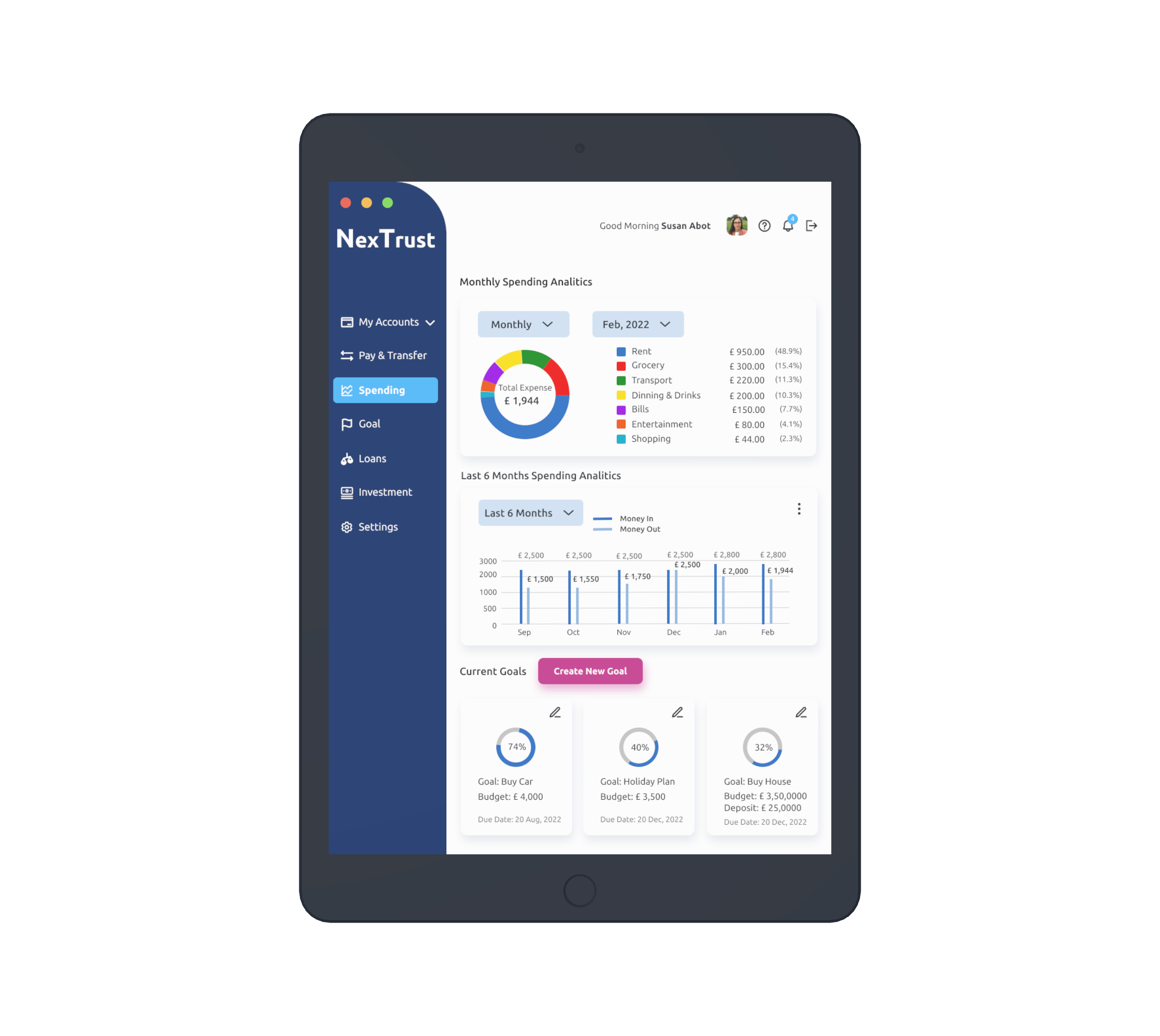
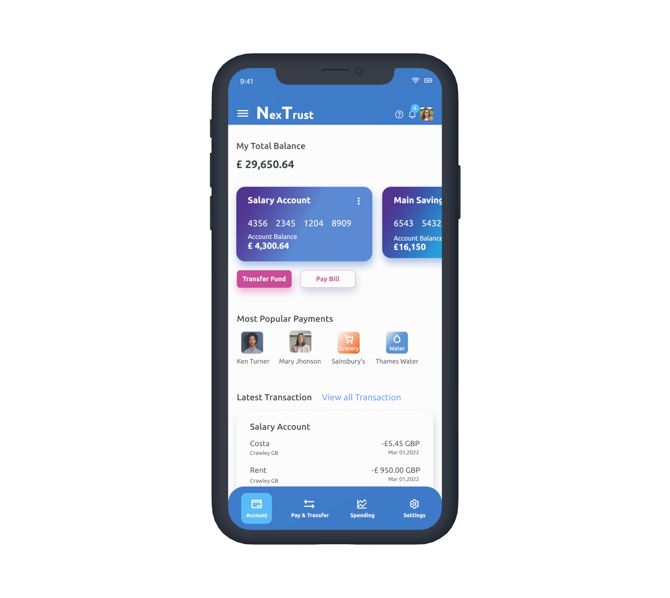
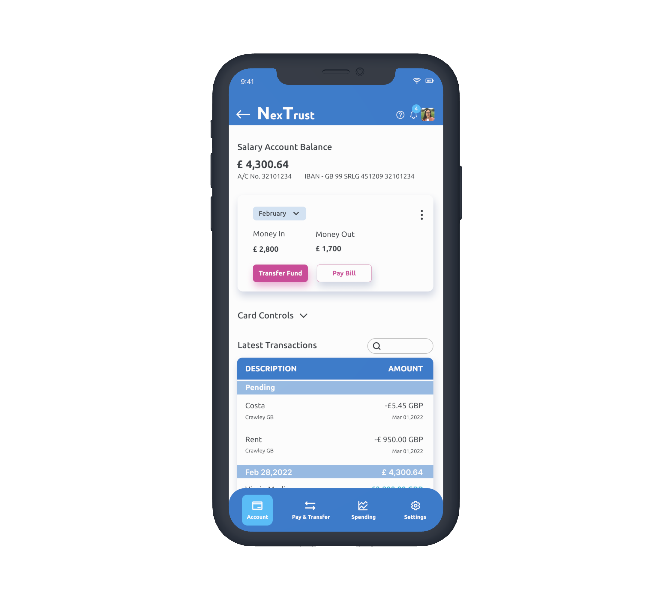
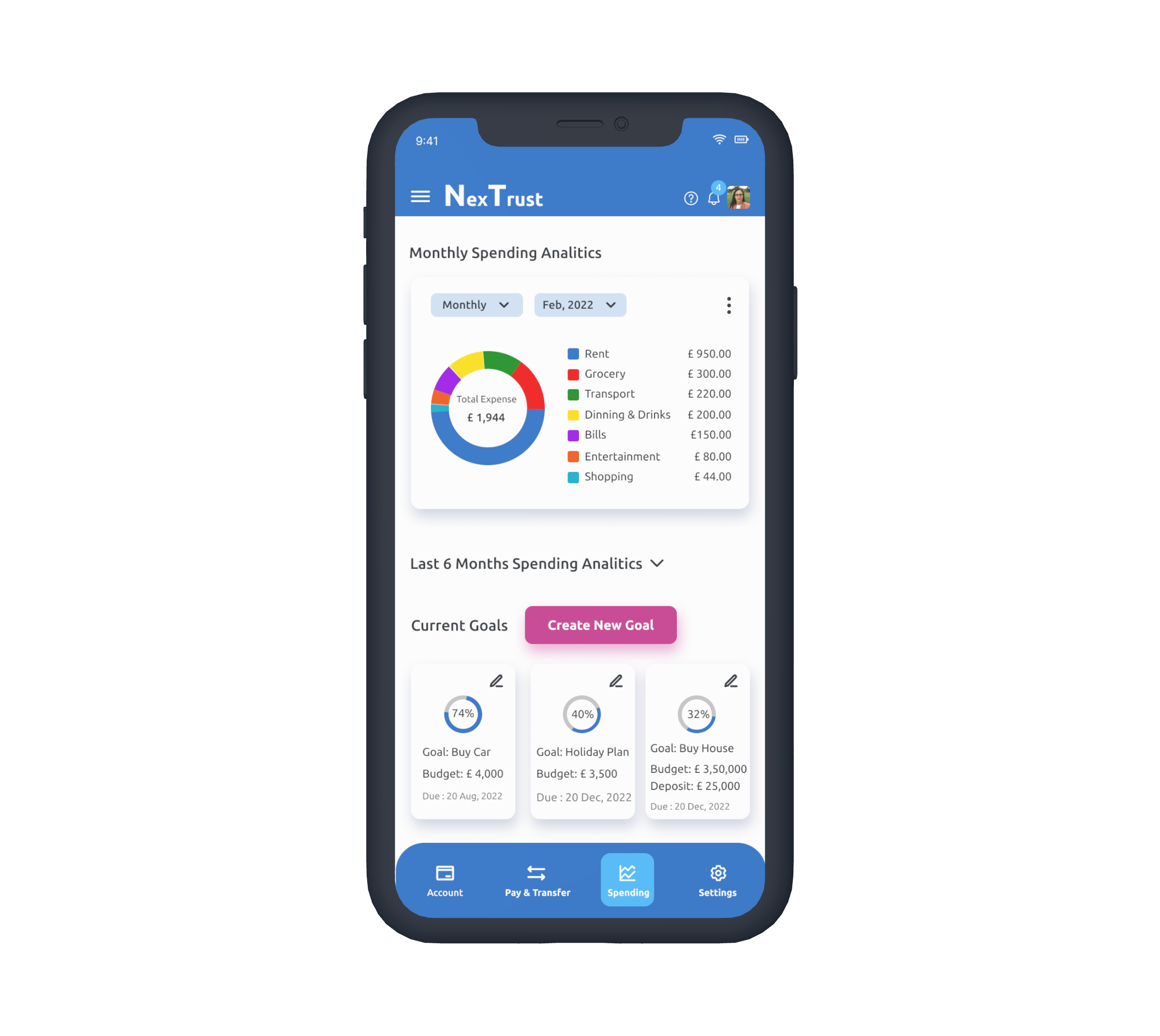
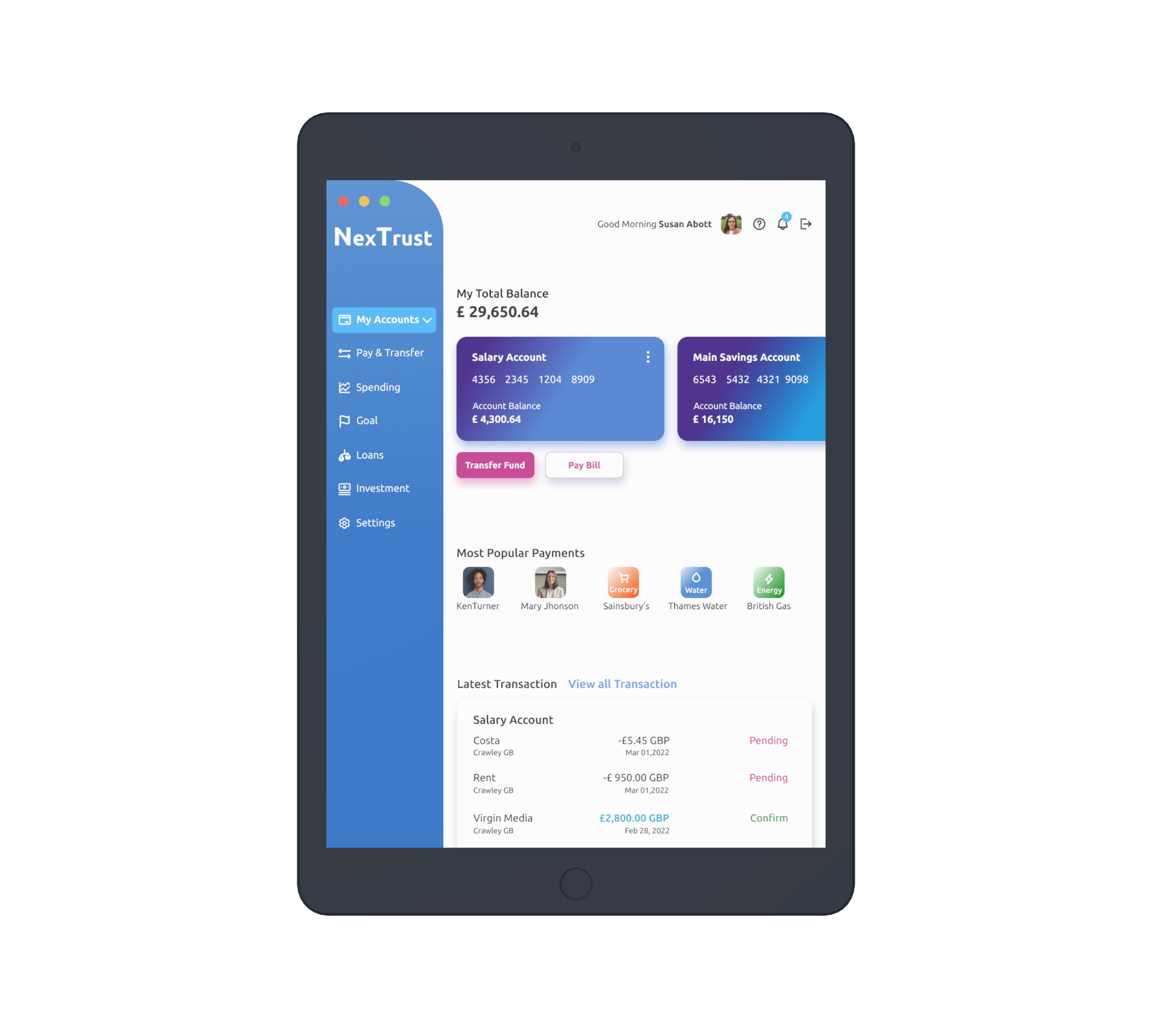
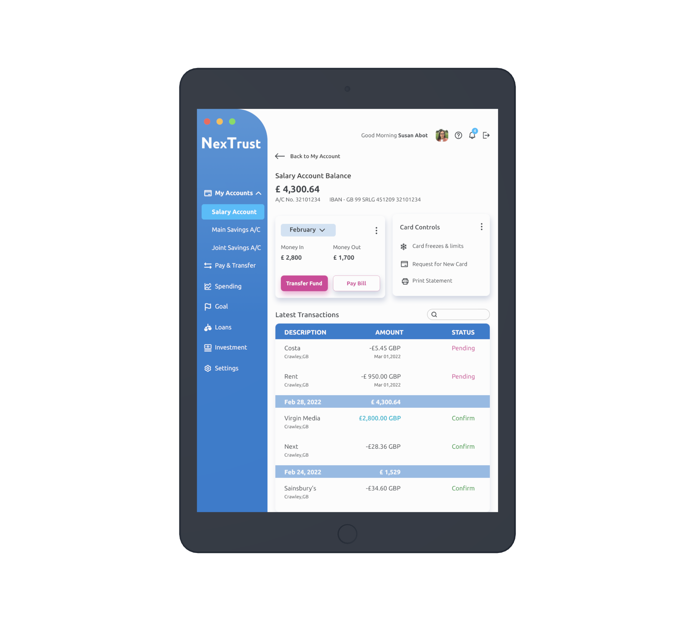
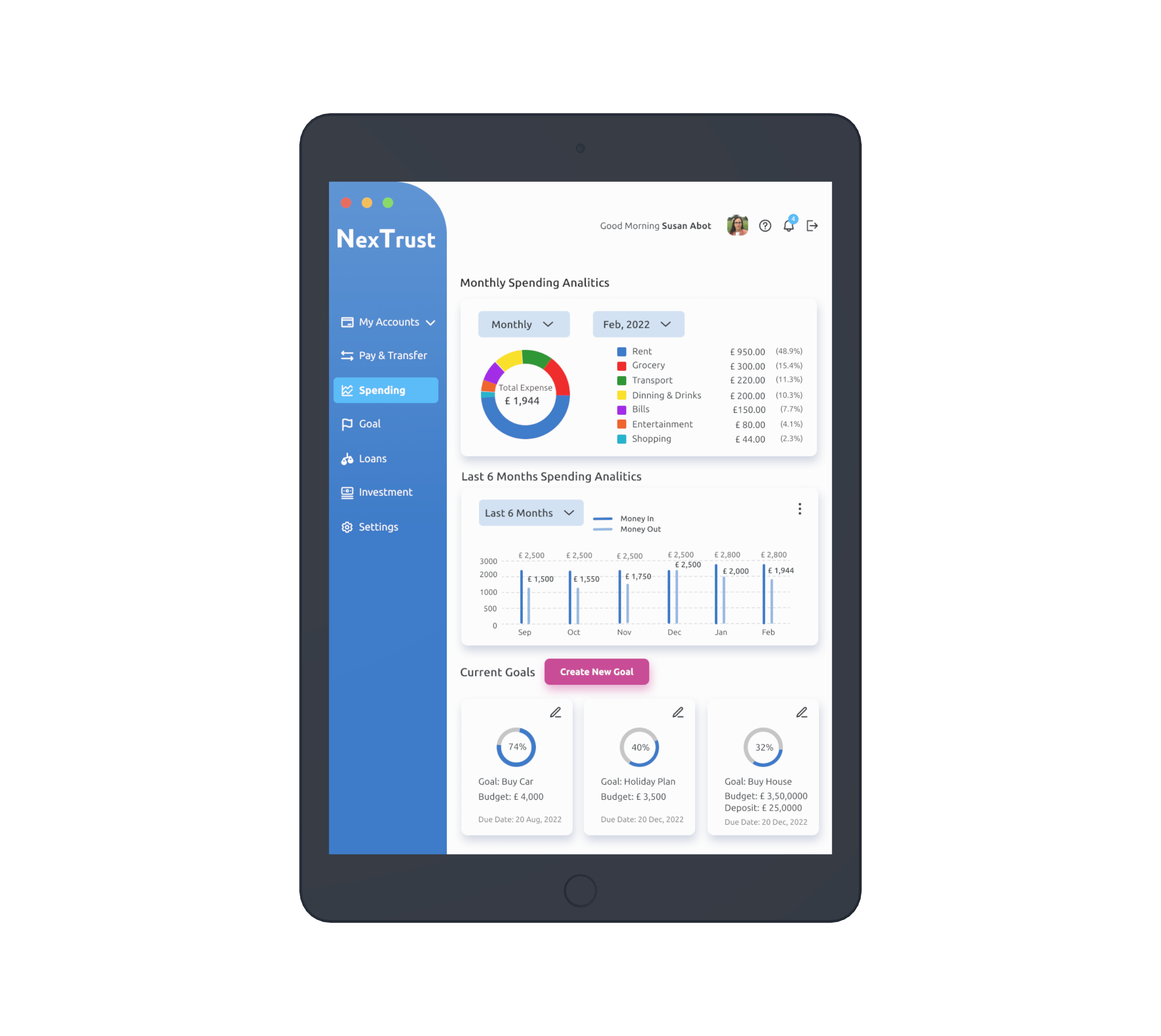
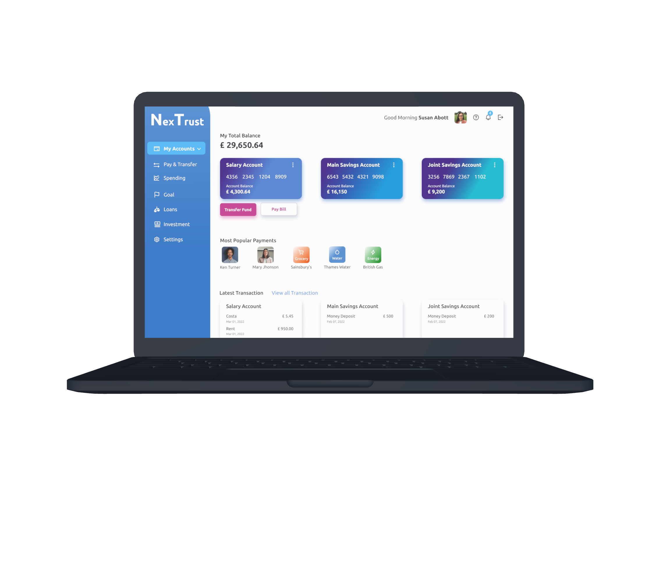
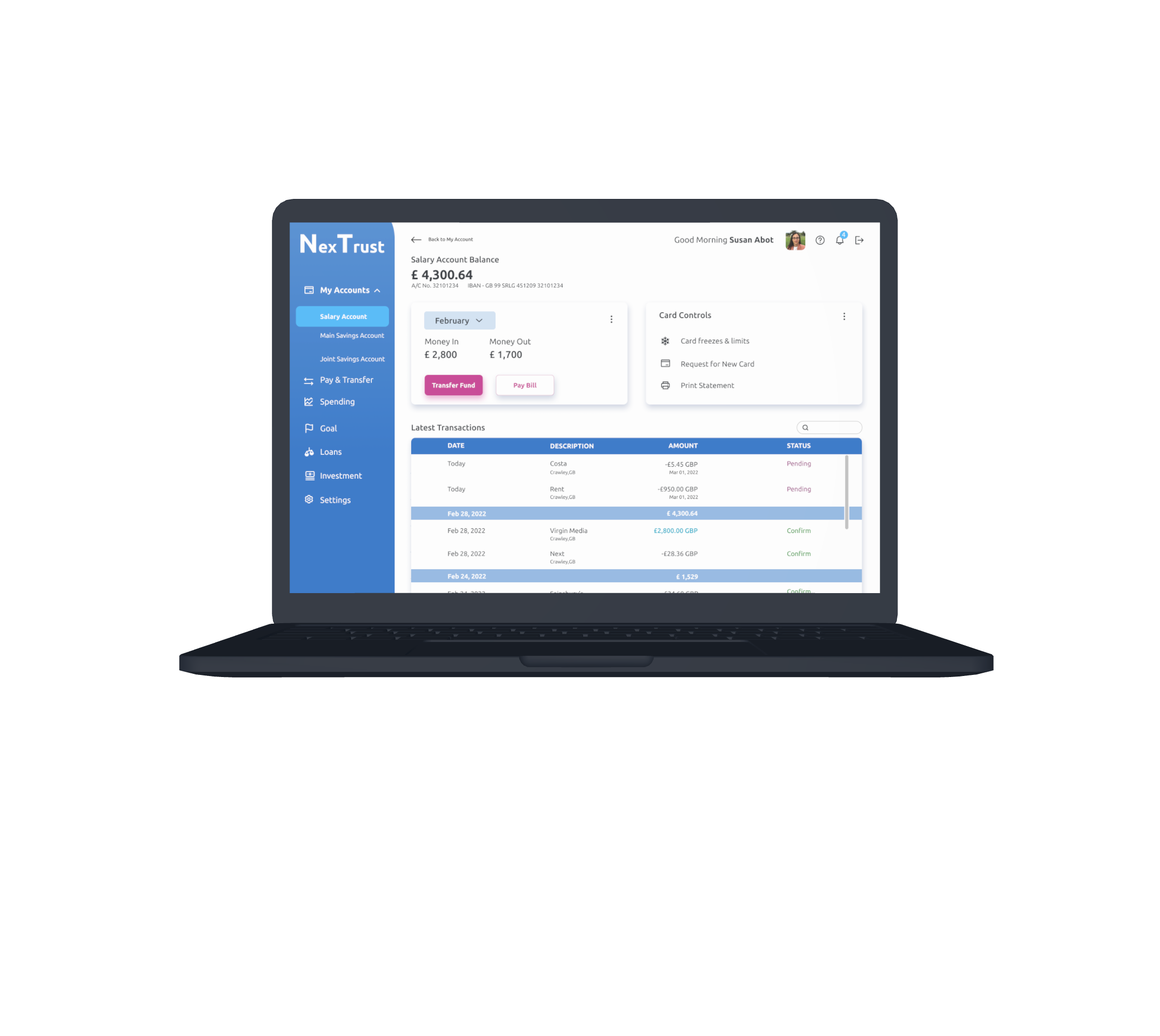
Personalisation with user name
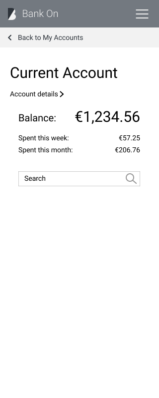
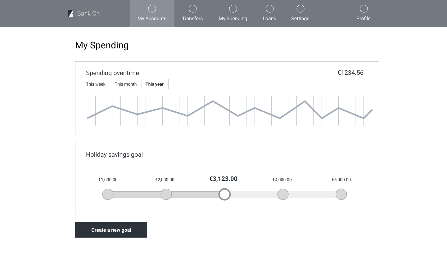
Total balance including separate account balances
Search option
Transactions with date, time, descriptions
Card controls option
Help
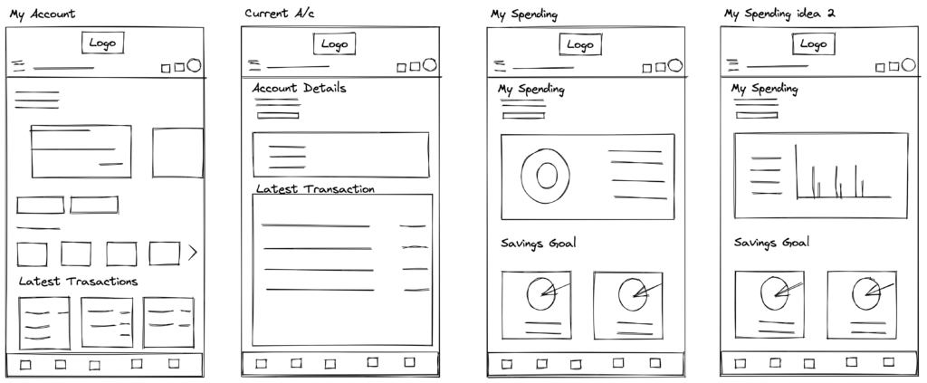
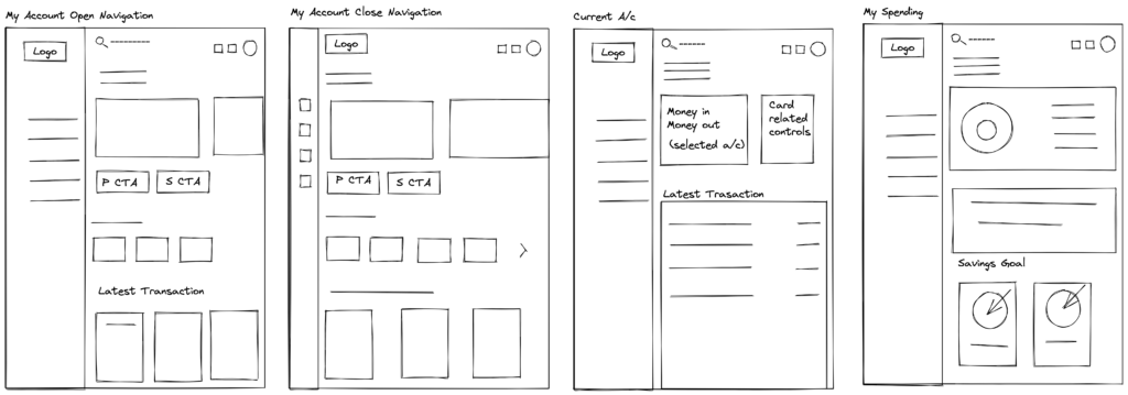
I started with concept sketching. I did quite a few types of screen designs to check what can be really a good fit. Some of the initial sketches to get the idea how screens might look in different devices.
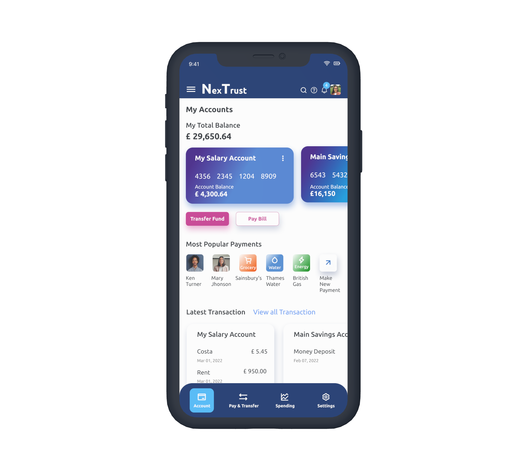
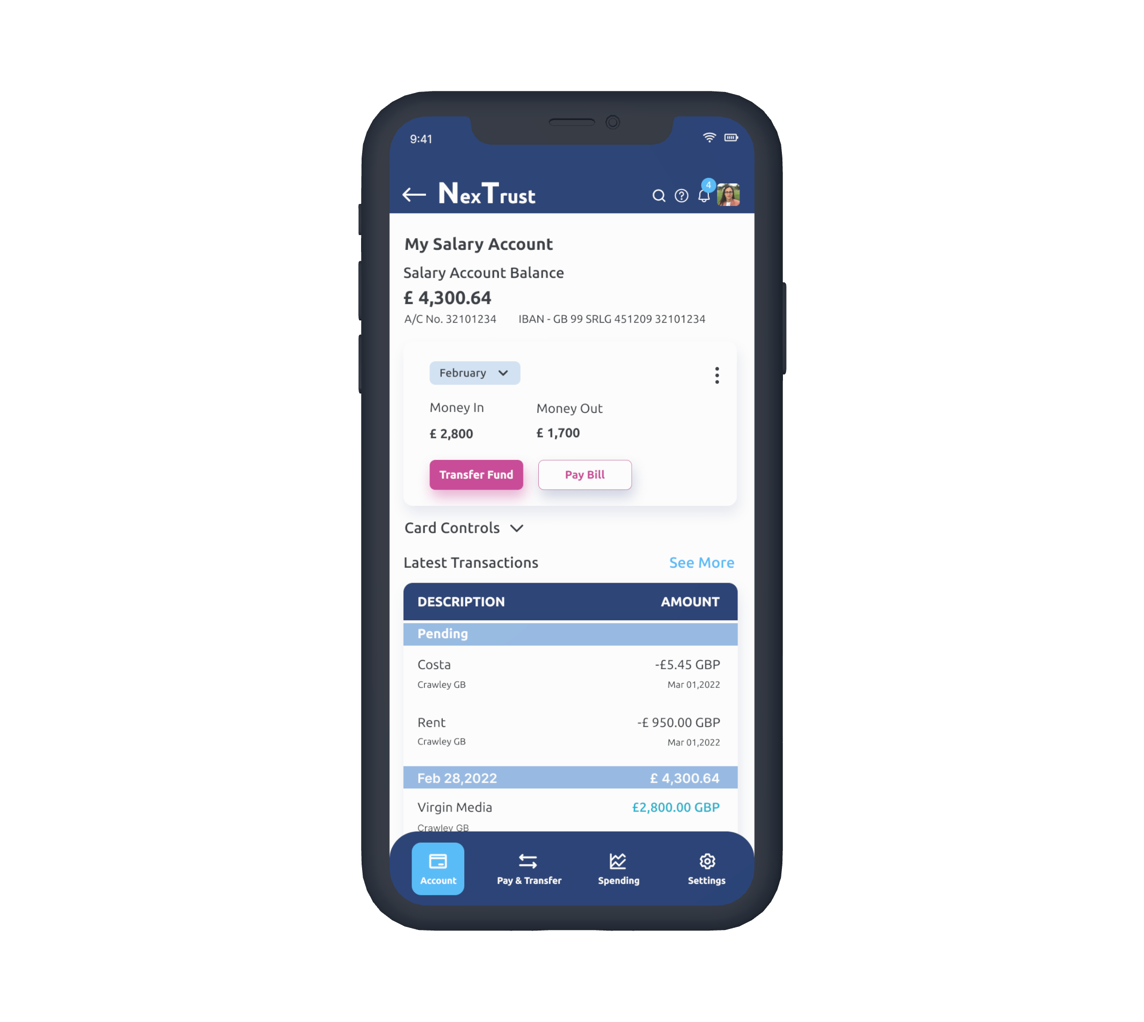
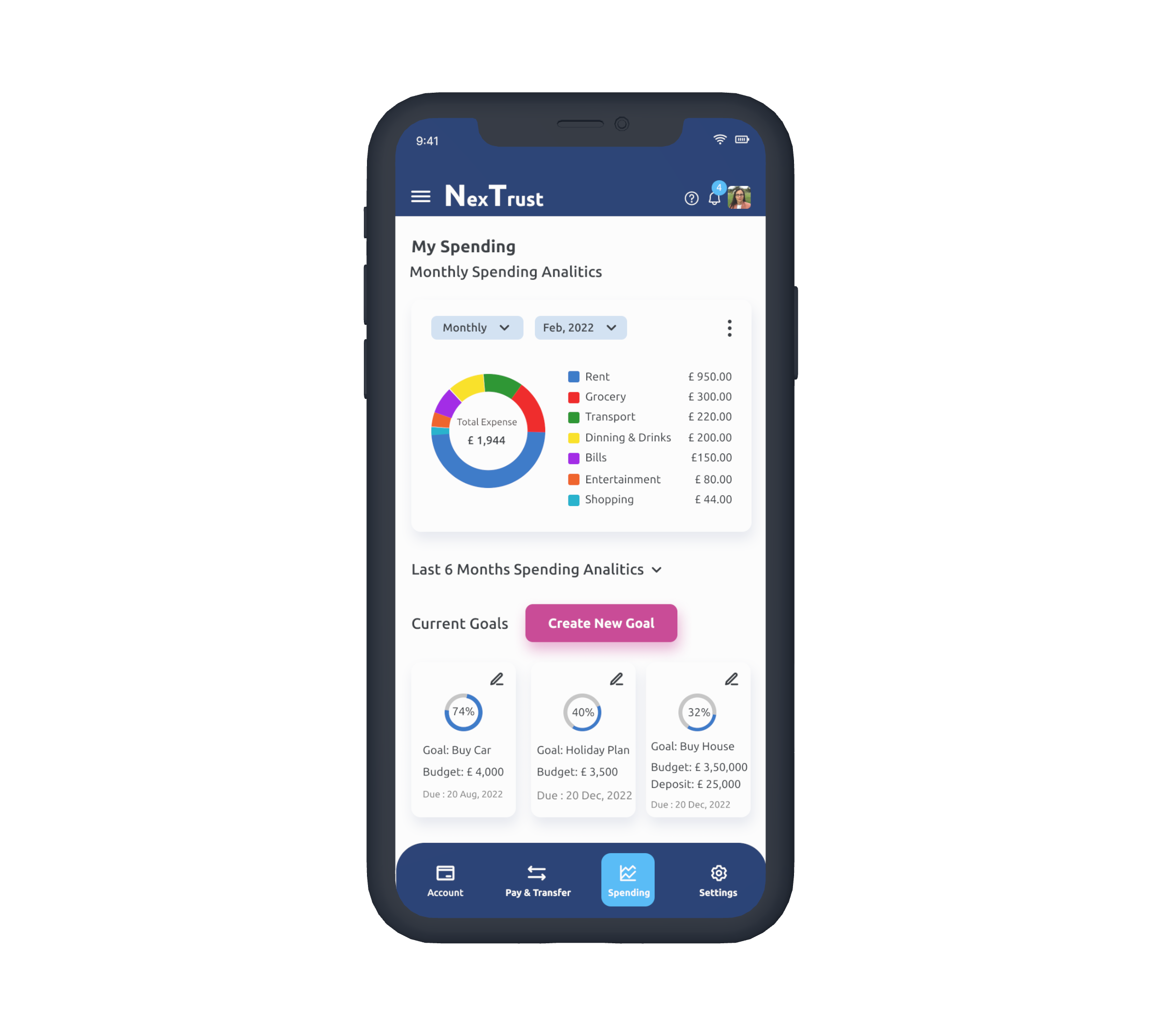
I started designing UI Elements and started selecting brand colours. The final design system is built after many iterations. Using the mobile first approach, the system evolved later for the bigger screens.
The goal was to establish Convention in the look and feel, add only those features which are needed on a screen to follow another design principle Progressive Disclosure.
The Navigation should be clear so that users can understand where they are and what to do next. Also created CTA in a different colour to grab the attention.
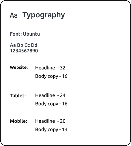
Typography
I wanted to do font pairing. Initially I paired between Playfair Display and Inter. But I didn't get that feeling that I was looking for. I wanted to make the look a little bit different from a regular banking app, so I tried Ubuntu, but decided not to go with the font pairing.
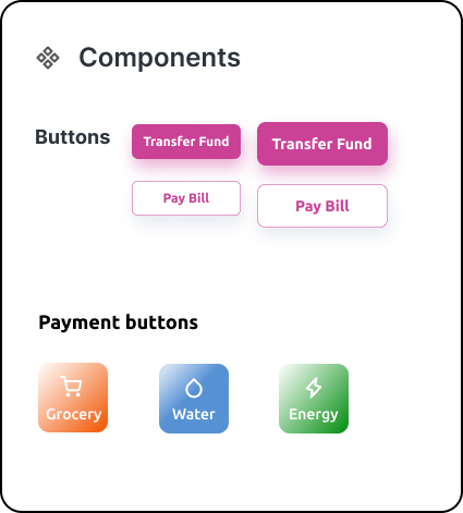
Components
The navigation drawer is easy to follow. Also clear when it is selected and showing clearly where the user is and where to go and how to go.The primary and secondary CTAs are distinctive from the rest of the design for its colours so that users can clearly understand the next step.I experimented with the drop shadows for the cards. It added a softness in the design.
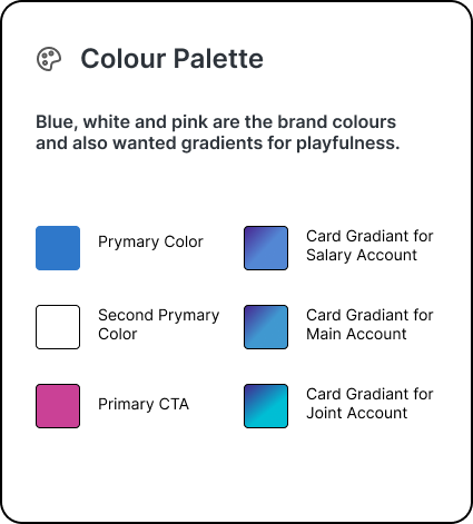
Colour-Palette
I collected inspiration for the colours from Dribbble and Pinterest. I experimented with colours and finally settled down with Blue, White and Pink as the brand colours. Card gradients are adding playfulness in the design. I experimented gradients in lots of combinations and finalised these three which are complimenting the whole website.
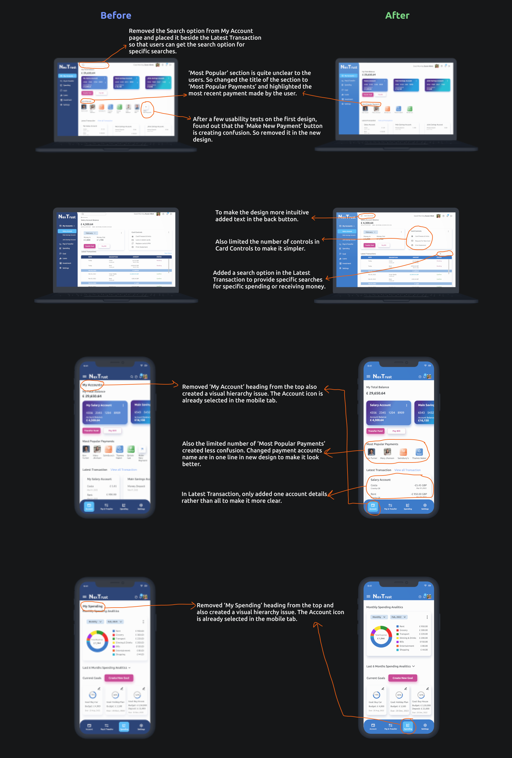
After the first design, I ran a usability test with four users to understand if the design is matching with users' mental model and how I can improve the design further. I understand that the look and feel is quite new to the users because generally banking apps are pretty straight forward. Look wise this app is a bit vibrant too, but that was my motto. I wanted to create an app which is trustworthy as well as playful.
I also found out some of my design decisions are creating confusion and unclear, so I tried to improve those areas.
Overall I got a positive response for my design so I iterated further for refining my craft.
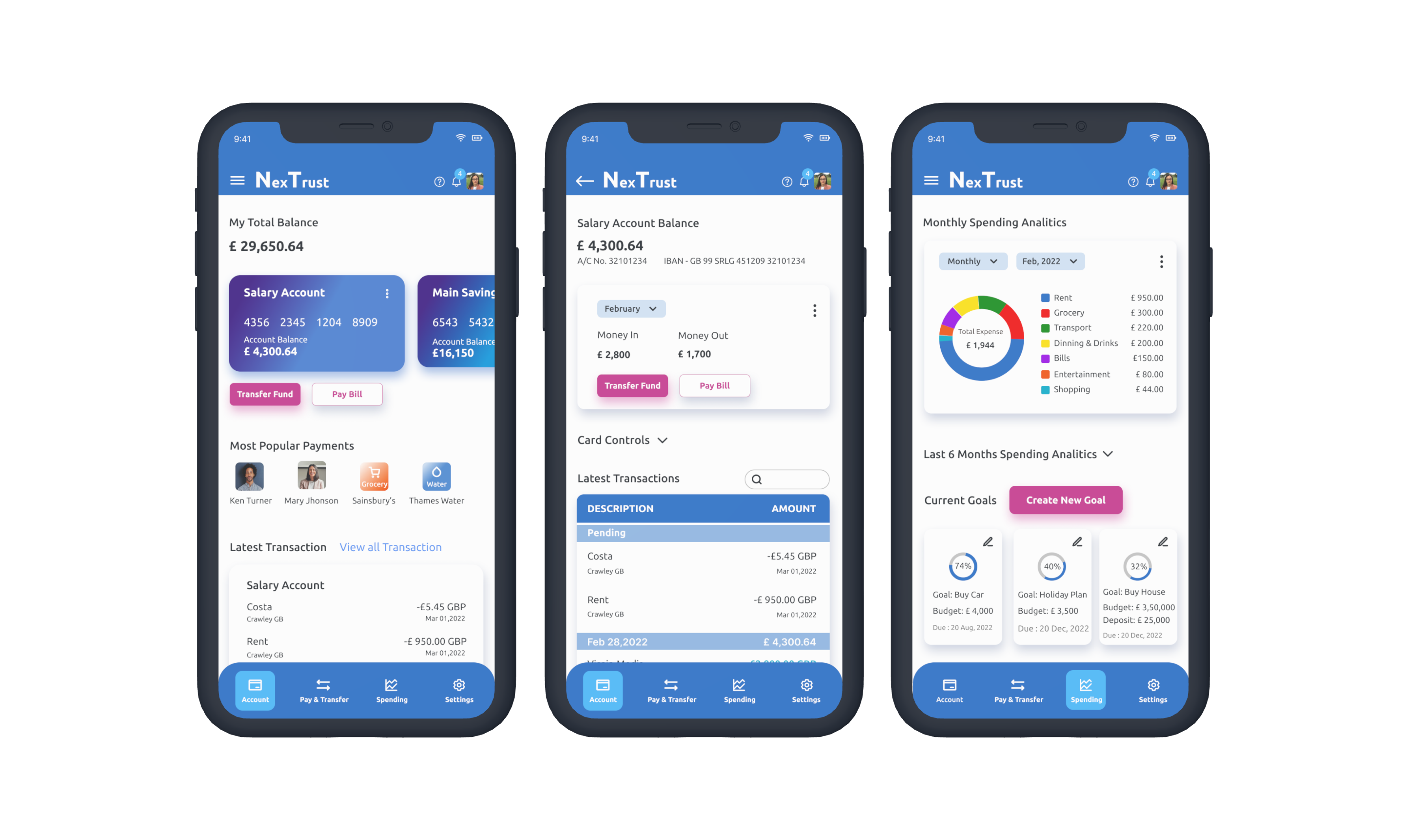
Click images to enlarge
Mobile Designs
Tablet Designs
Desktop Designs
This is my first UI Design project and through this project I learned about how to use grids, white space, how to choose colours, accessibility, detailed responsive design.
I found it difficult to make it pixel perfect for the first time so I iterated it quite a few times. I tried different components and colours. I enjoyed creating gradients on the cards and navigation menu. I did some experiments before I selected the final gradients. It was fun to create the transaction cards for mobile, tablet and desktop.
I was kind of satisfied with this first attempt. But soon realised I need more practice, so I have been practising daily with daily ui challenge and copying popular apps. I am also documenting what I am learning and about my design decisions.