UX Case Study - Research and Design
Hire & Go
A user-friendly and intuitive rental car booking solution for your next holidays
"People ignore designs that ignore people."
UX Research
UX Design
Prototype
"People ignore designs that ignore people."
A startup car rental company, who are looking to create a user-friendly and intuitive online booking system based on a deep understanding of their target users.
Part of the UX Diploma
UX Designer
UX Researcher
5 Months(During The Course)
Google Slide
Google Forms
Google Zoom
draw.io
Figma
At first, I tried to understand conventions and best practices in similar digital products. Then conducted a survey to gather customer preferences and requirements and usability tests to see how users are interacting with the products.
During the analysis phase, I used affinity diagram to discover pain points and priorities for improvement. I created user flow to determine the flow and user's interaction. then the low-fidelity sketches to design the screens and finally designed the prototype.
At the end, I validated my prototype with users and redesign it based on the inputs. In an ideal situation, I will deliver it to the UI Designer.
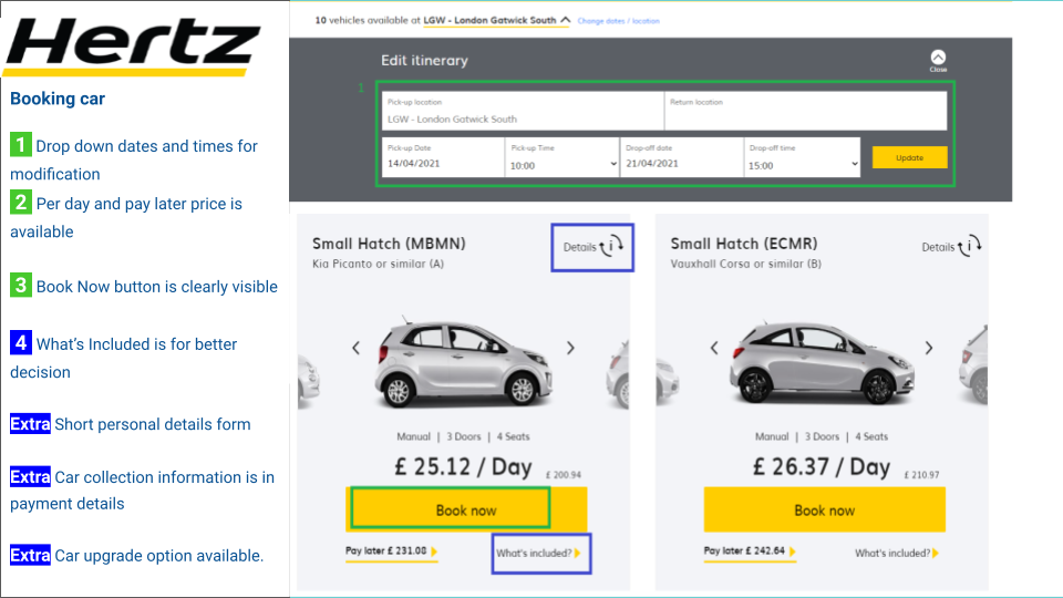
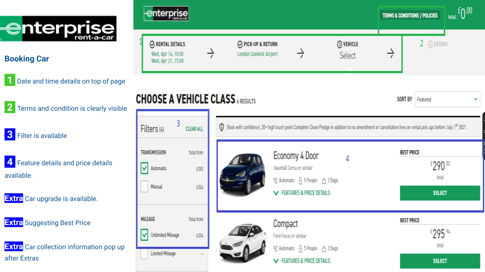
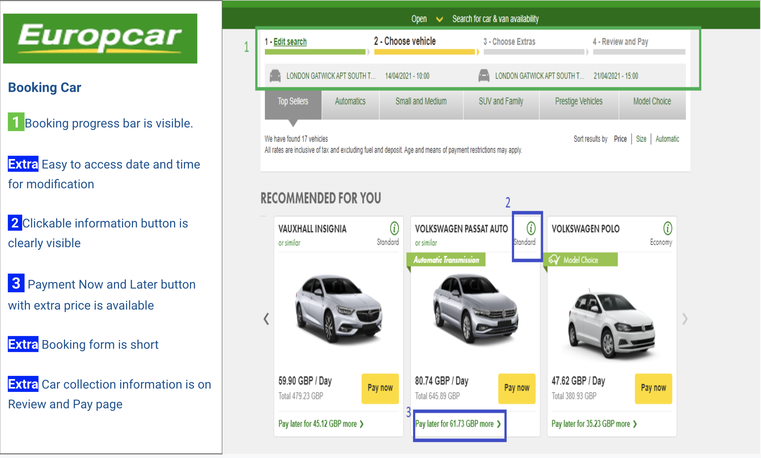
For a startup, it's important to understand how dominant players have established the booking process, what are the conventions and best practices, how they're addressing issues and targeting customer base.
Leading global car rental companies like Enterprise, Hertz, Europcar and Expedia are considered in the benchmarking because they are the best-in-class. I analysed Homepage to Payment Form of each website.
Key Takeaway
Competitive Benchmark provides a clear idea of how the booking process works, what are the standard approach to present the key features and what to avoid in the process.
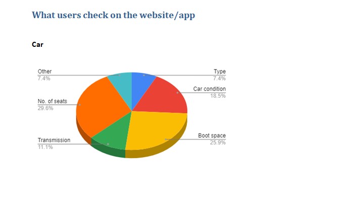
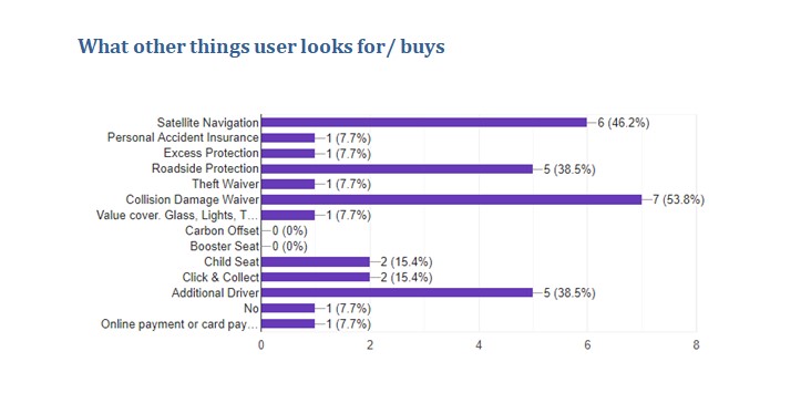
I conducted an Online survey to gather quantitative data on users' behaviours, preferences and requirements for renting a car. I found it's a great way to gather a large amounts of user data to understand the pattern.
Key Takeaway
I came to know what information is important to the users and what users like or dislike about the car booking process.
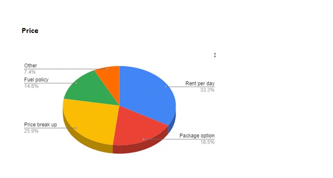
Competitive analysis and survey data provided a structured booking process, users preferences, requirements and user expectations. I conducted Usability tests to find out:
Key Takeaway
I got really interesting insights and identified pain points which later helped me to make an improved design for better user experience.
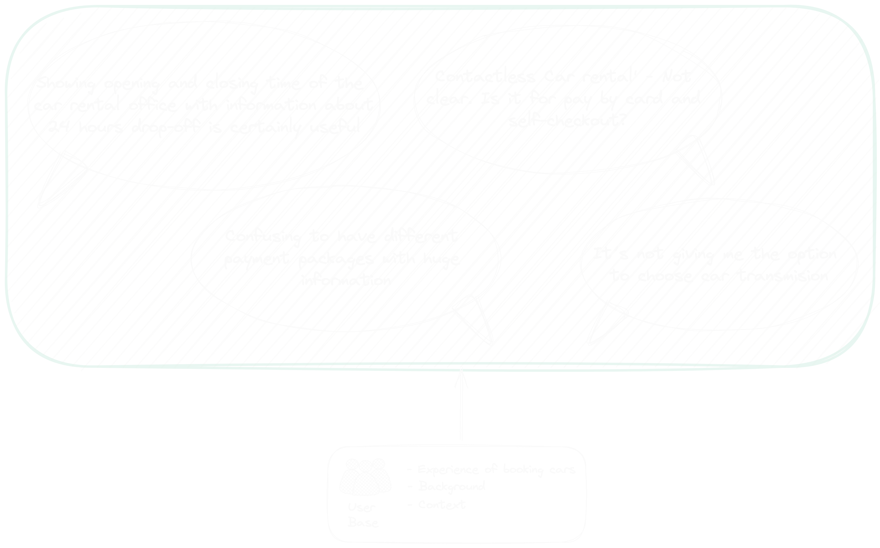
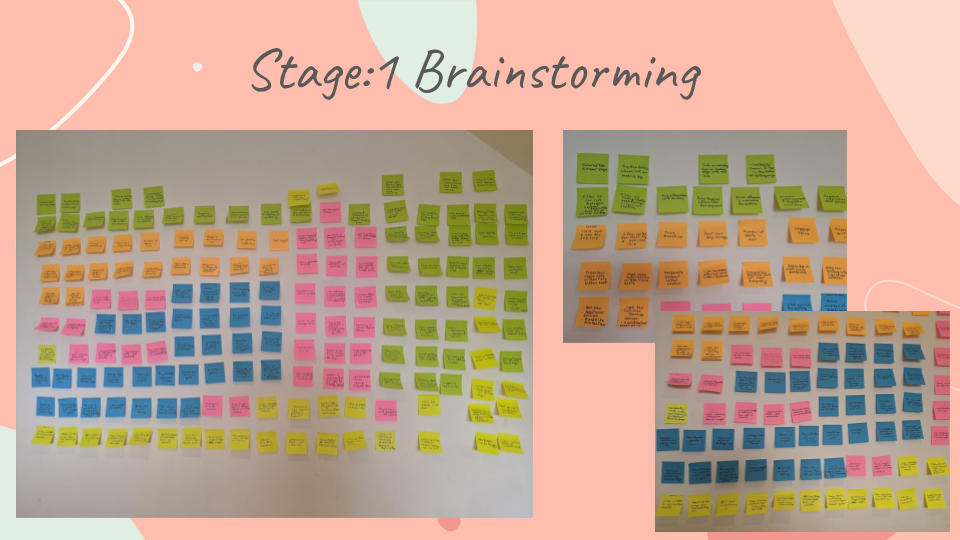
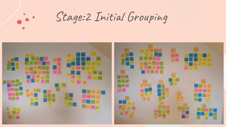
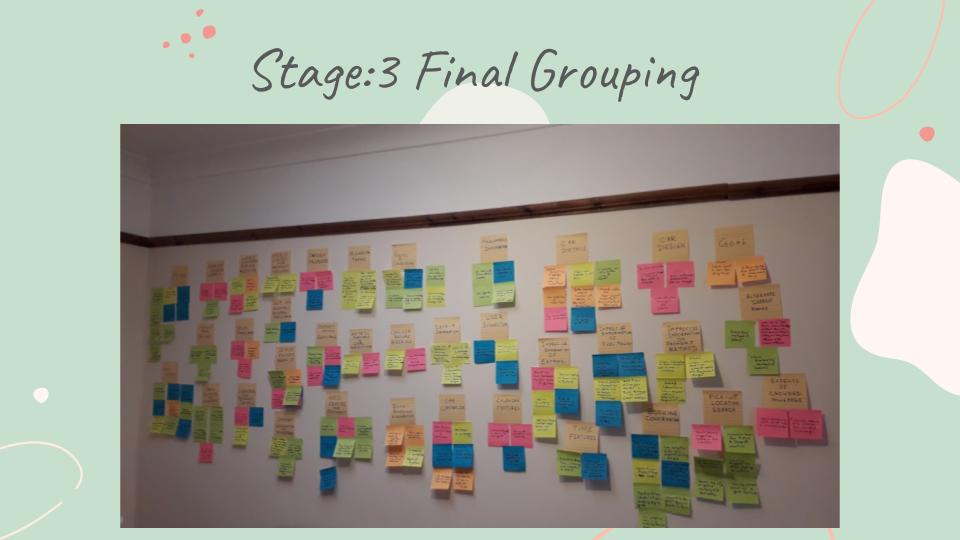
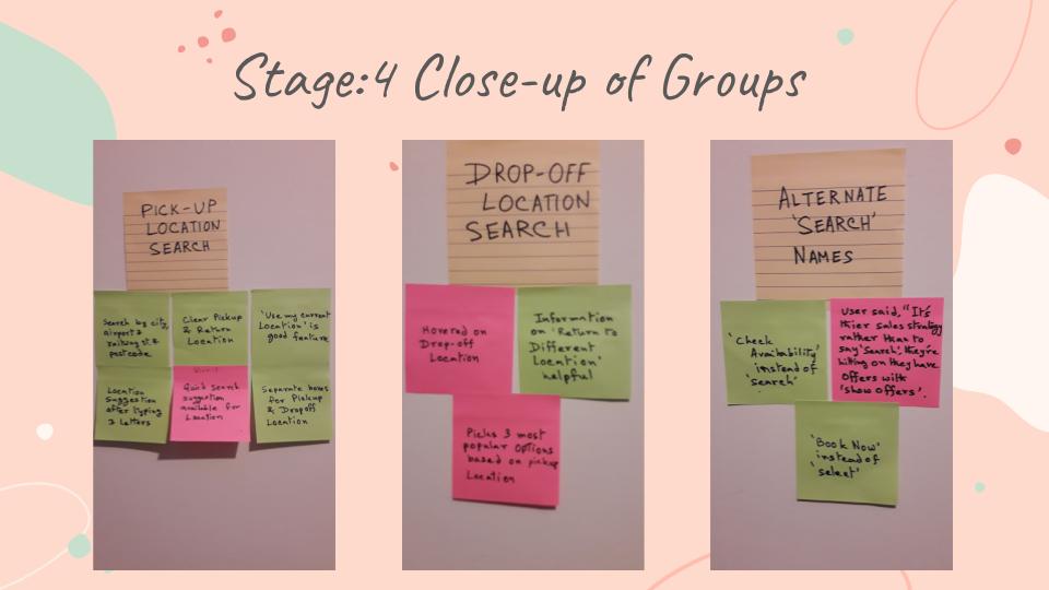
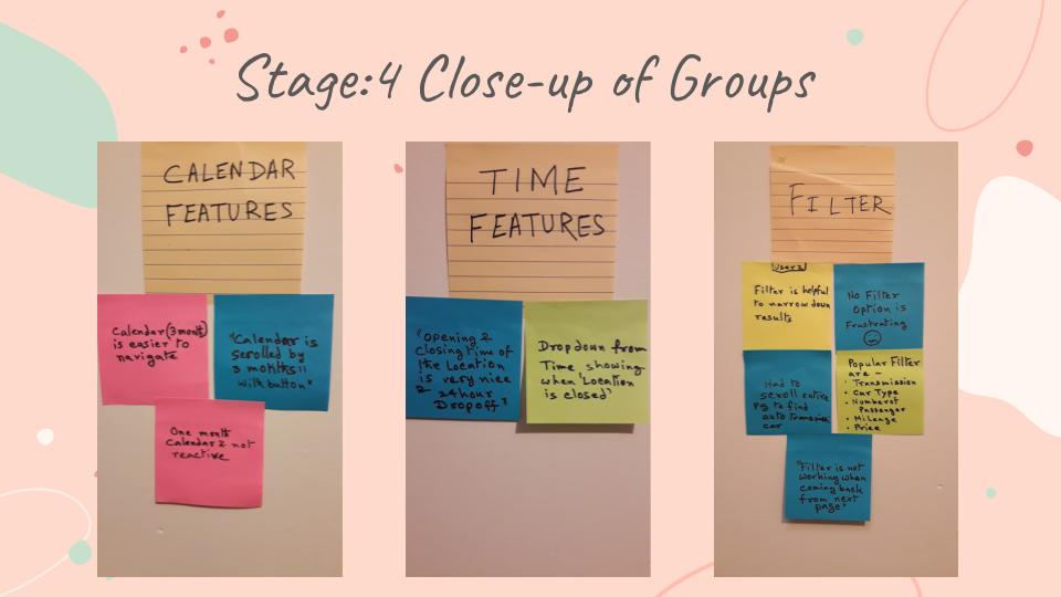
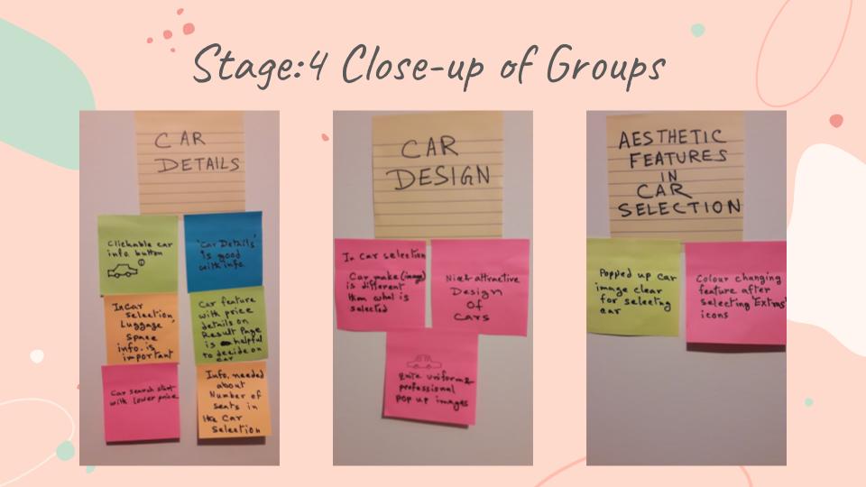
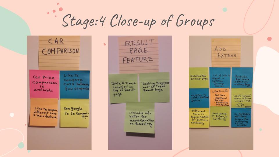
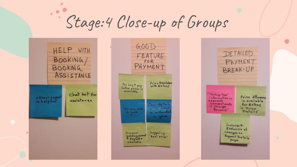
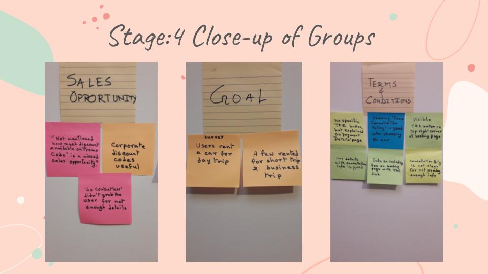
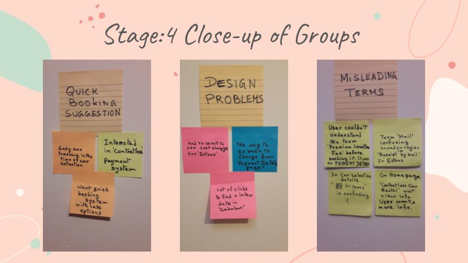
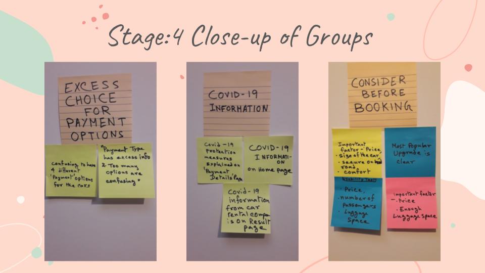
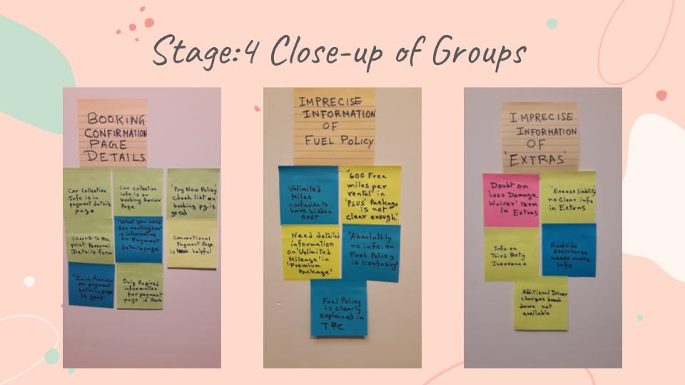
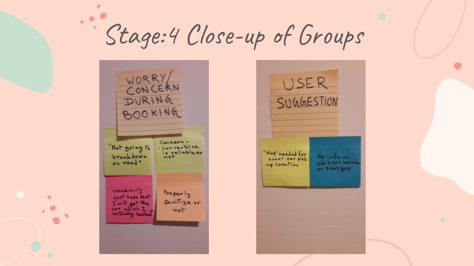
I wanted to organise huge amount of unstructured raw data and wanted to narrow down my focus on important areas and pain points, so I created Affinity Diagram with the help of a friend.
I shared all the research data with my friend. We organised all the post-it notes in granular groups and grouped with a name. Then it was easy for us to understand their relationship to each other.
Key Takeaway
We discovered what to follow and what not to follow for each feature, identified pain points and priorities insights for improved and better user experience for my design solution.
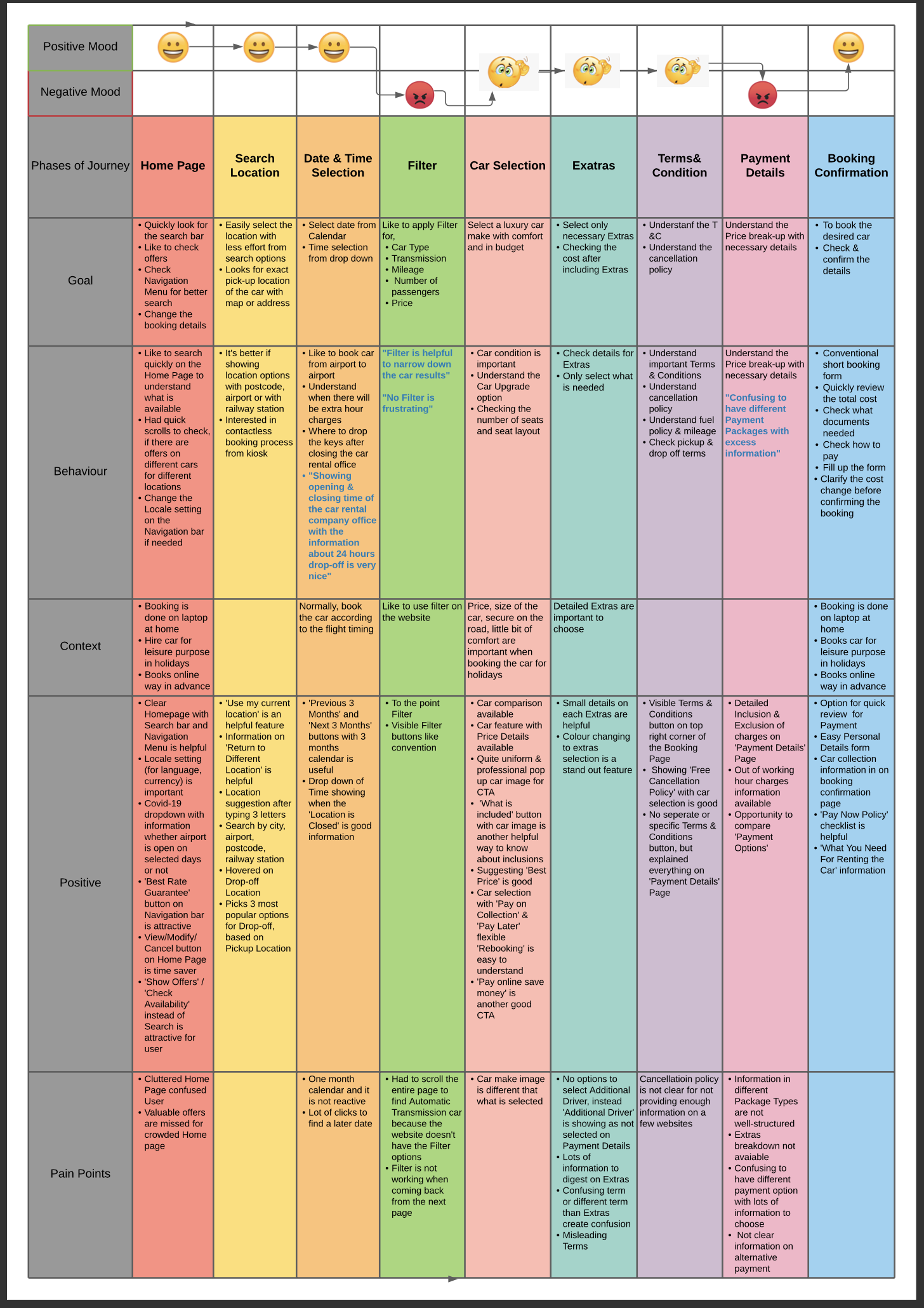
As next step, I created Customer journey Map to visualise how the user is experiencing as they are interacting with each stage of booking. This journey map helped me to see the product from users point of view and increase the chances of improvement in my design.
Interestingly, after creating Customer Journey Map the booking process become more clear.
Key Takeaway
Better understanding of user perspective and flow of booking process.
After structuring raw data with Affinity Diagram and Customer journey map I found some interesting insights.
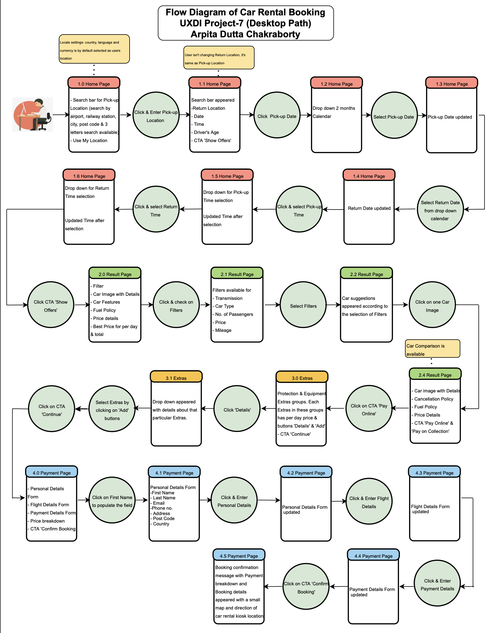
I created user flow based on the happy path to understand how users would complete the task and their flow in the booking process. I only considered top one flow.
Key Takeaway
User Flow provided me a path from start to finish how the user will go through the booking system step by step.
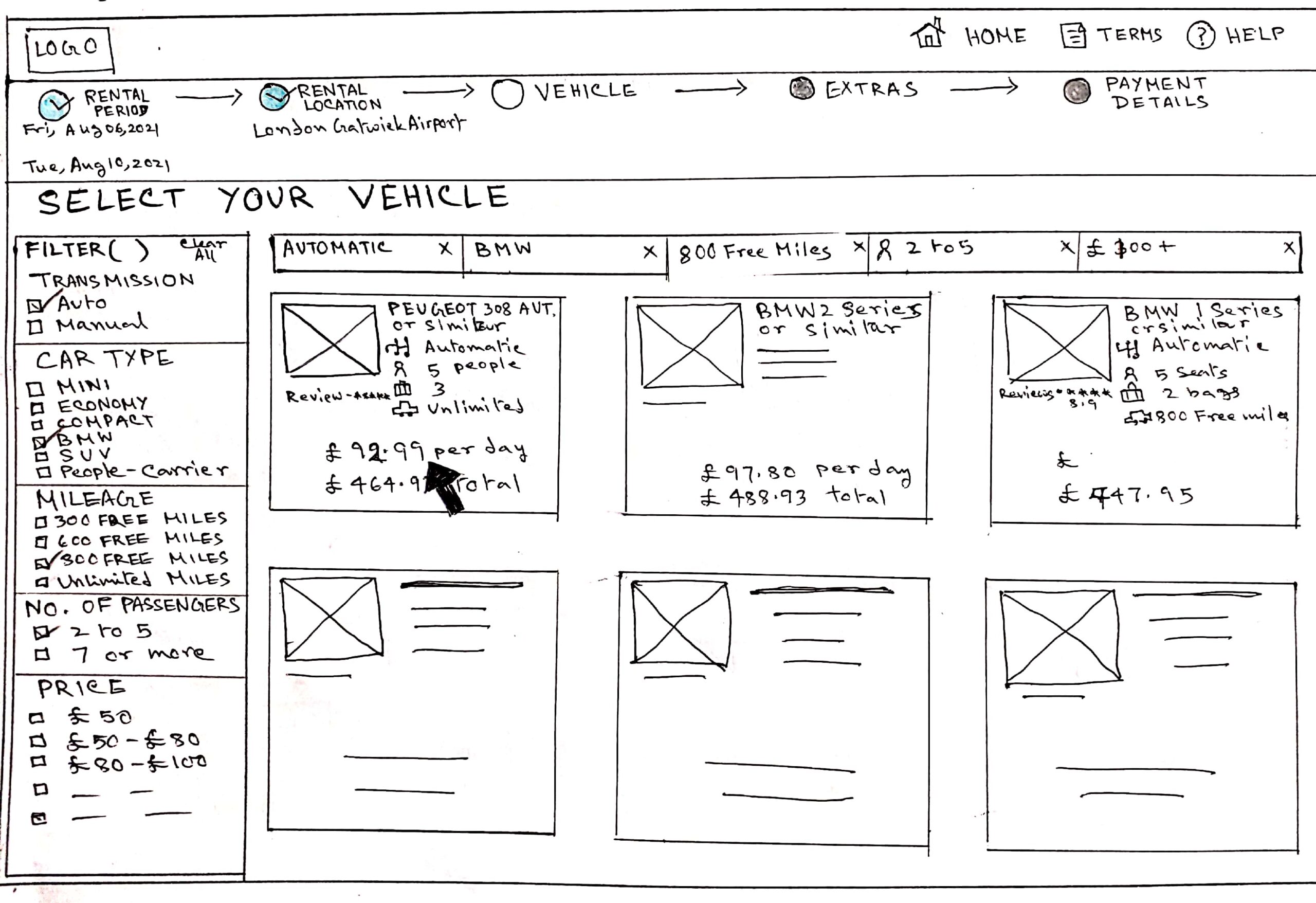
To understand the concept, mental model and the flow, I created a quick low fidelity prototype. But it is iterated later with new learning and understanding. This low-fidelity prototype also came from a deep thought. Initially, I drew each page quickly 2 to 3 ways and then I selected the best design according to my understanding.
Key Takeaway
Understood the basic functionality and also how the features will fit together.
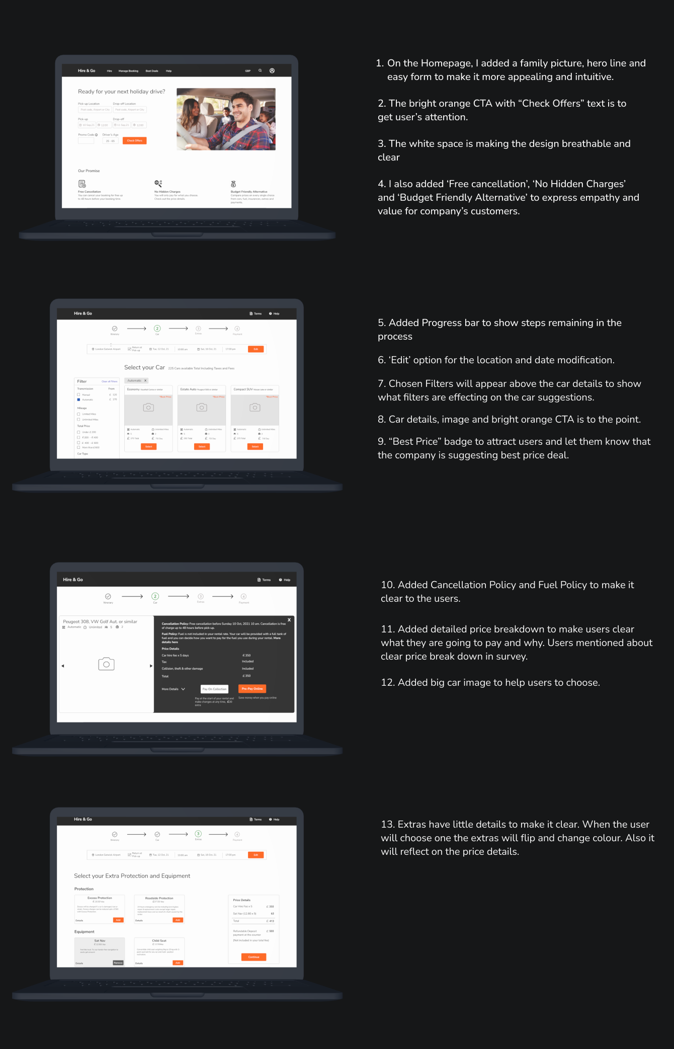
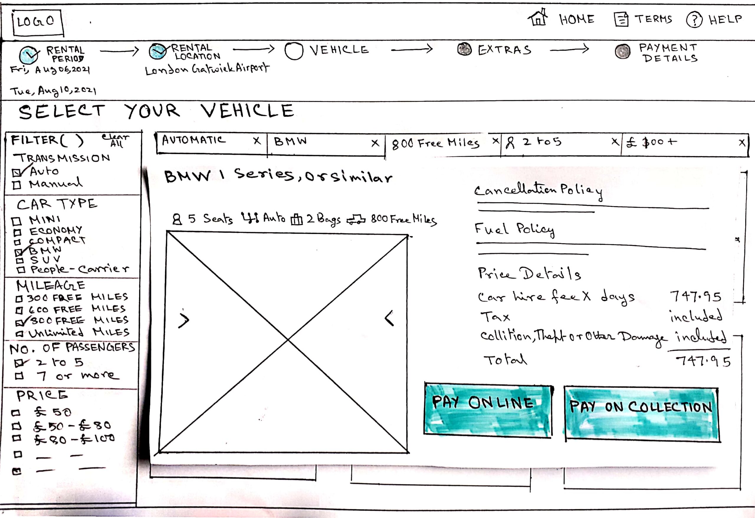
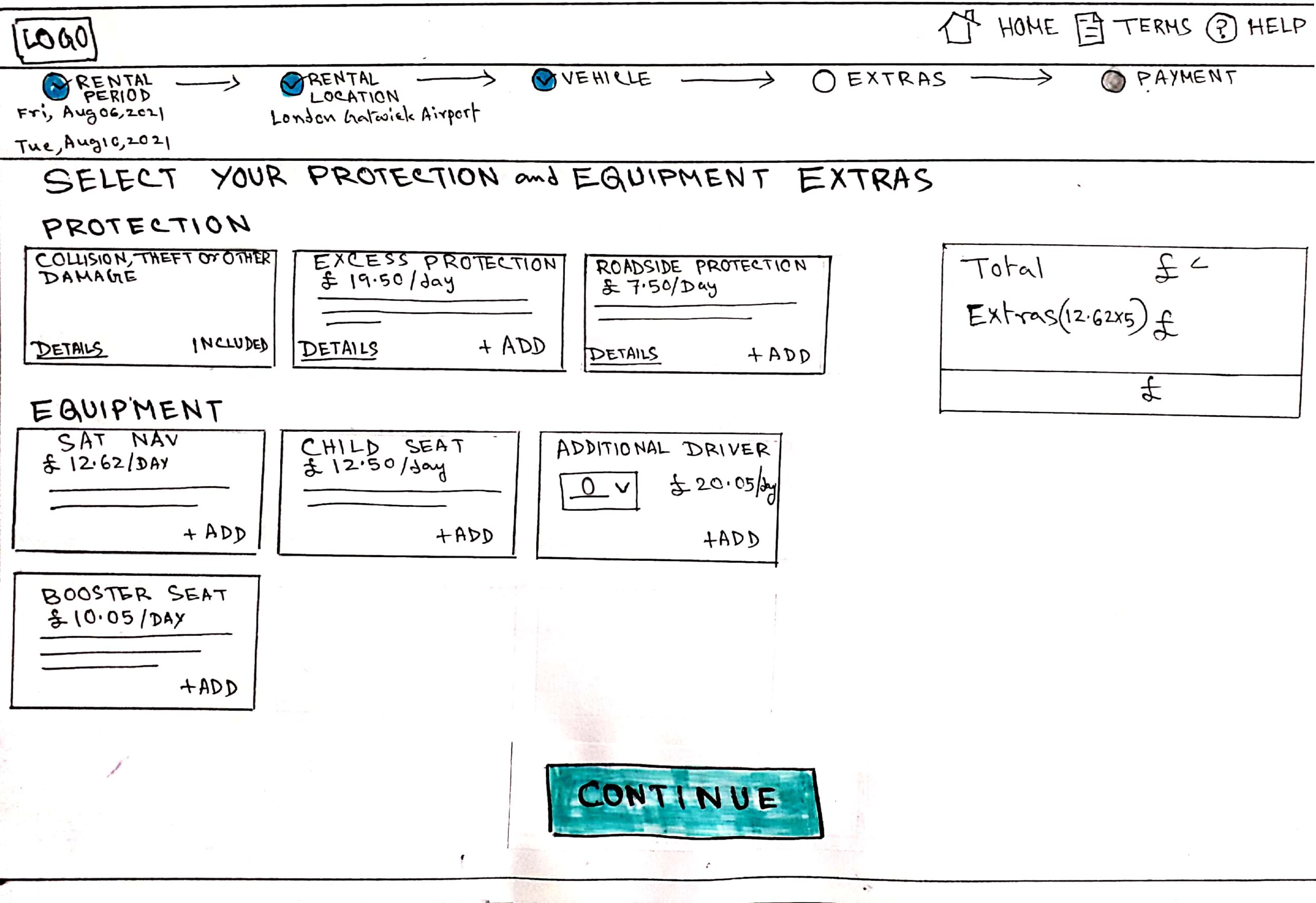
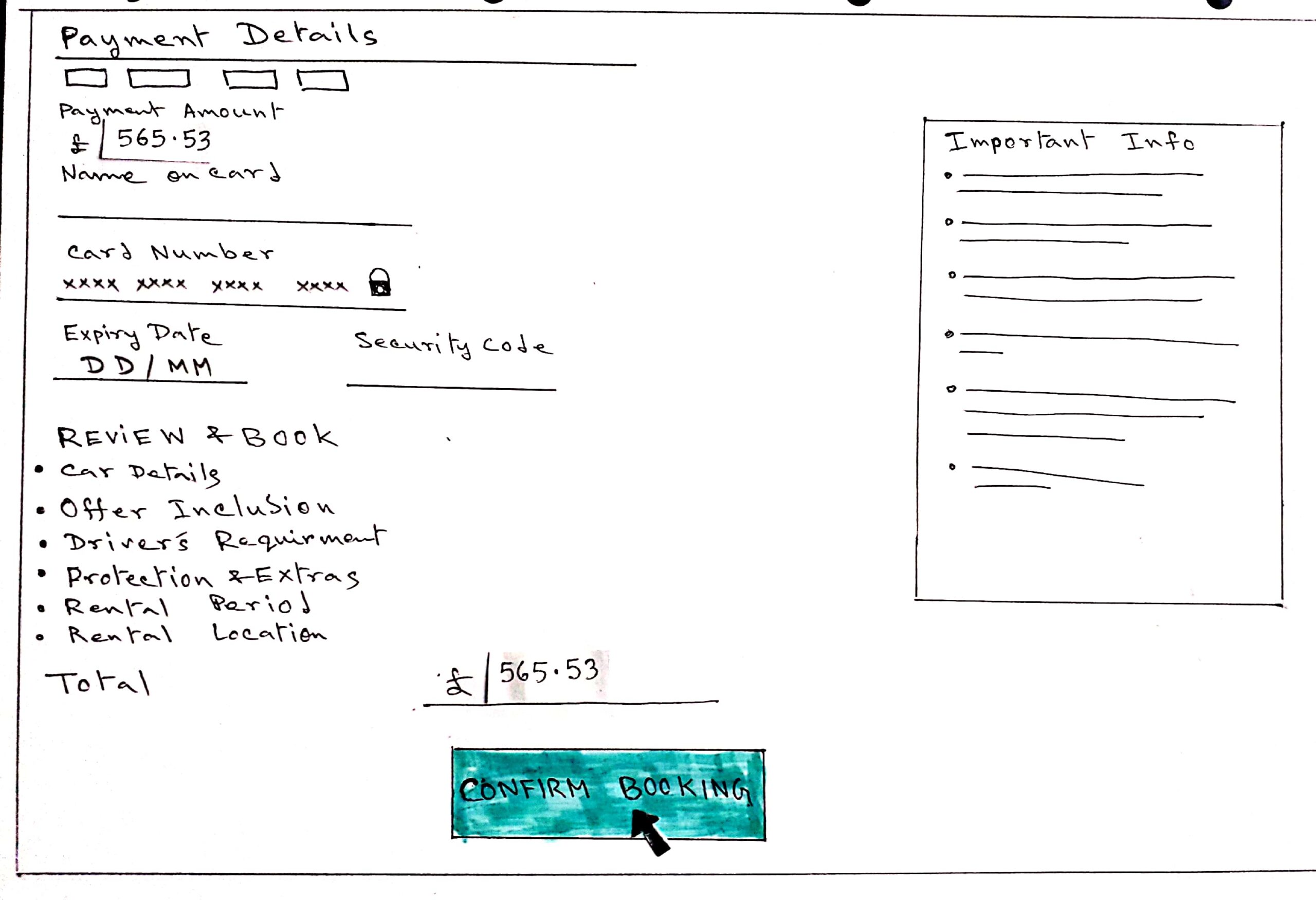
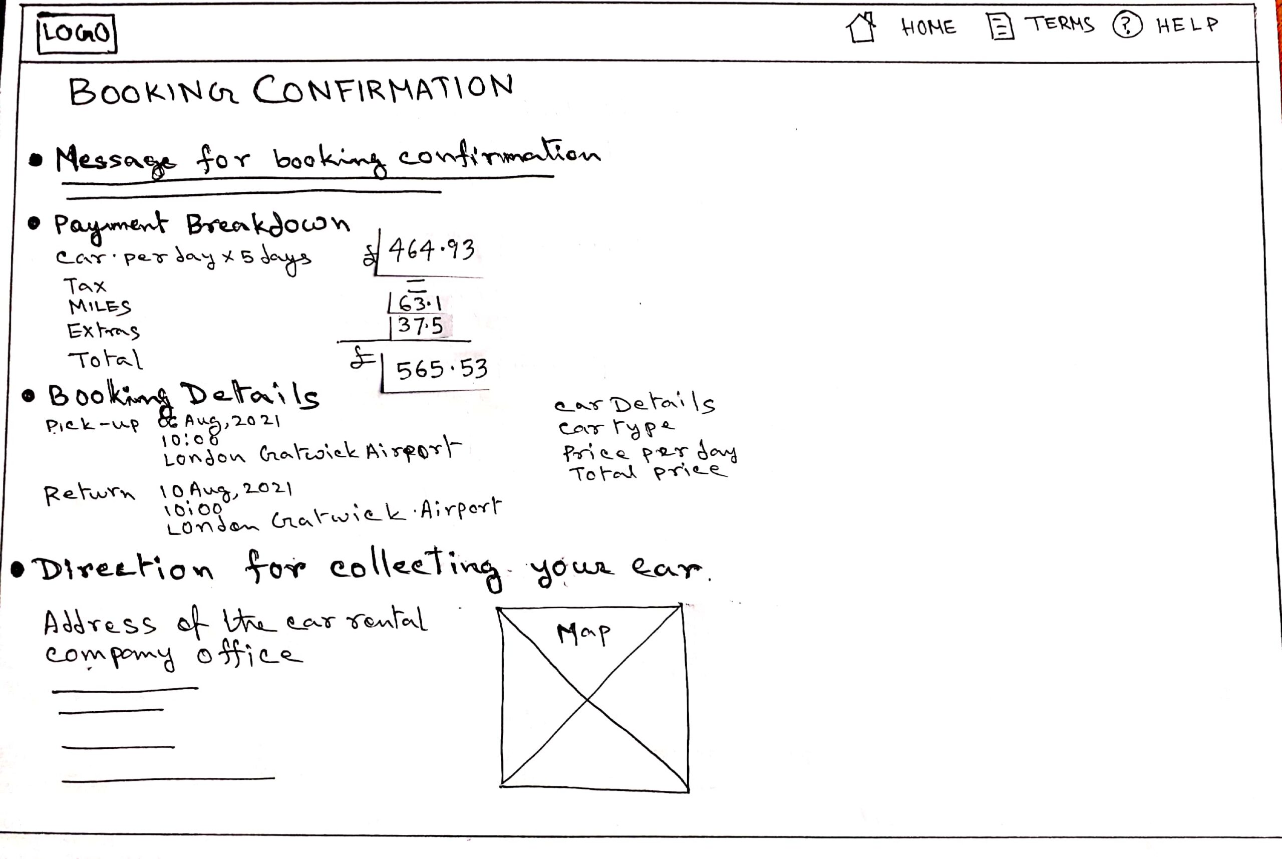
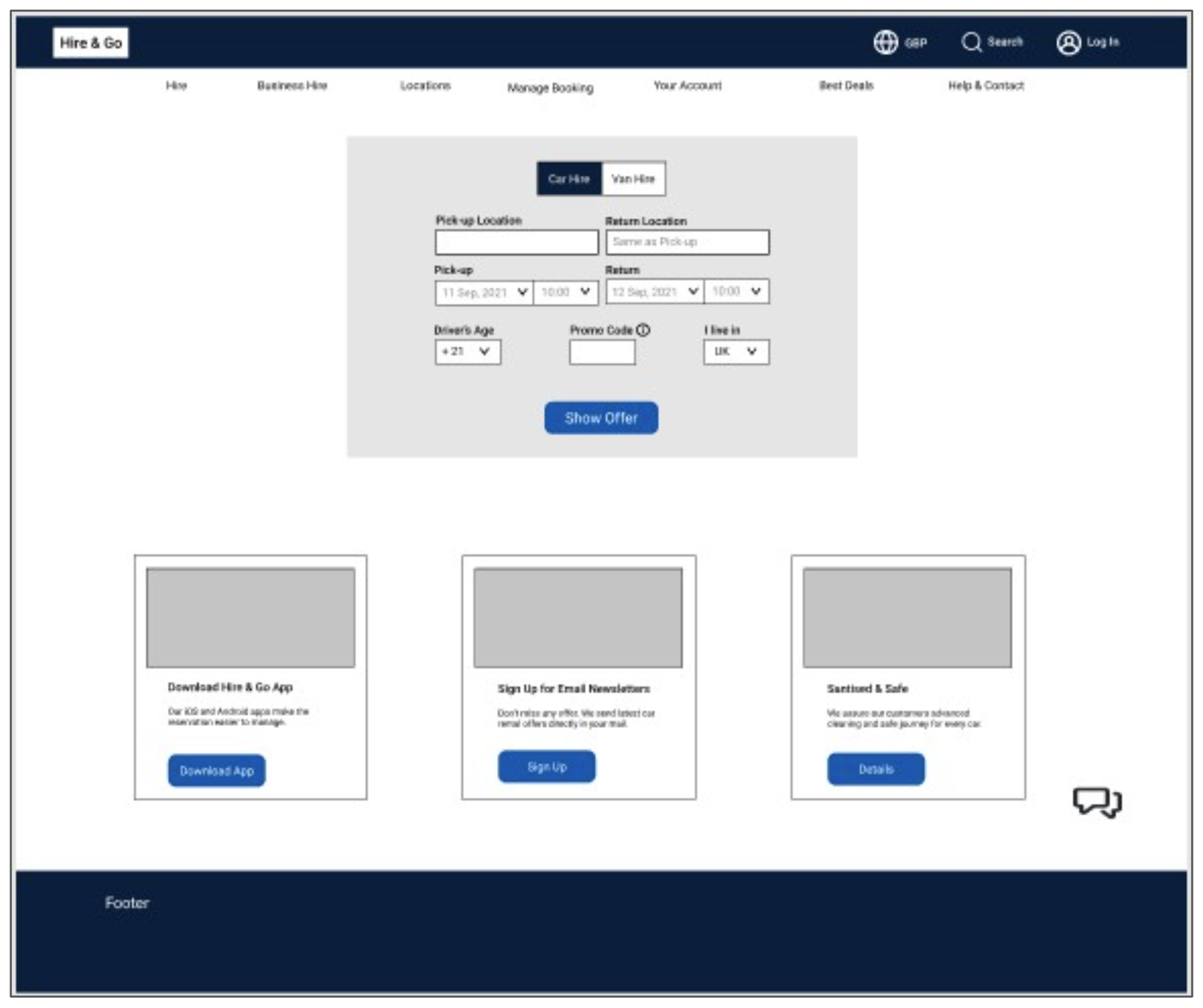
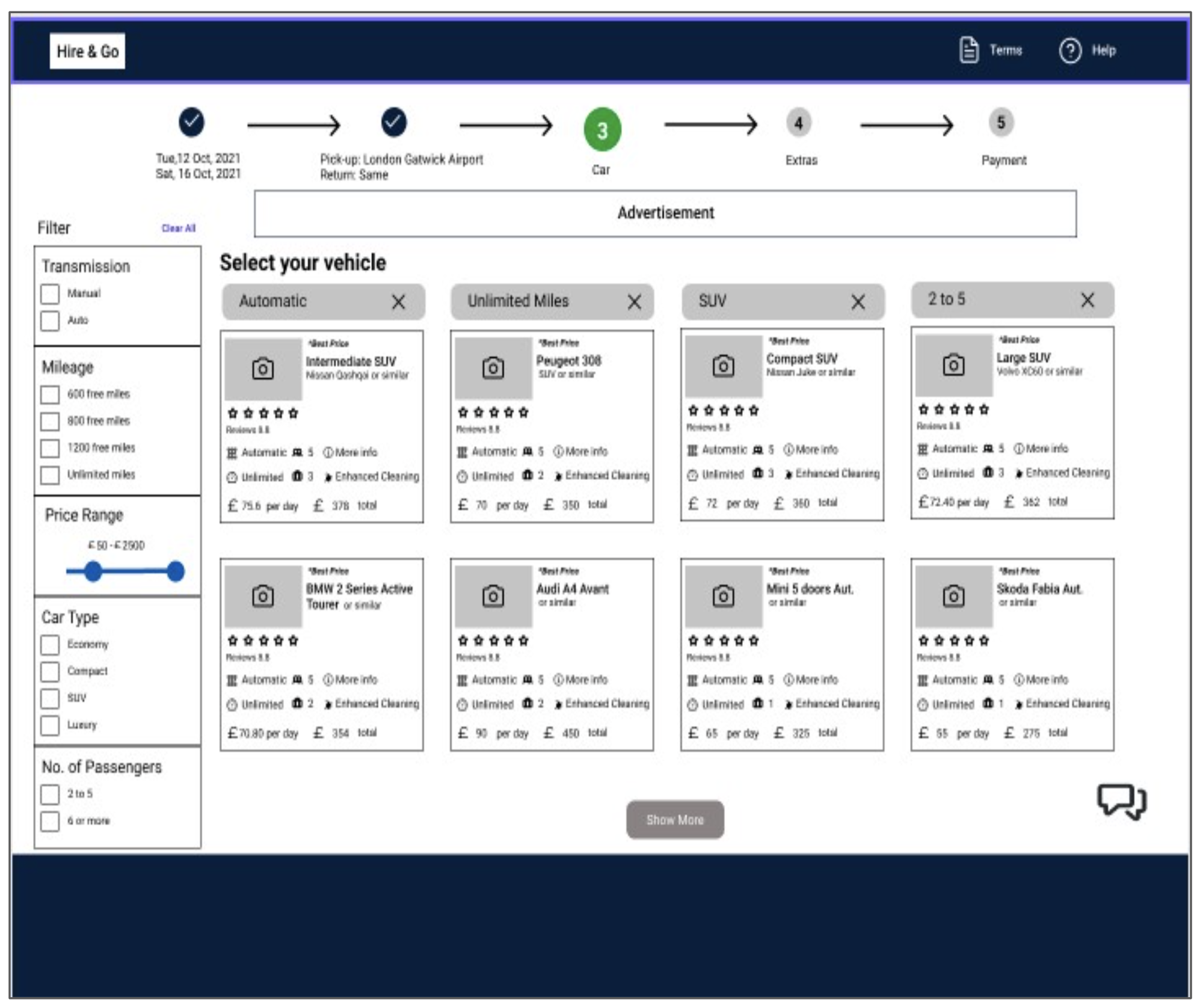
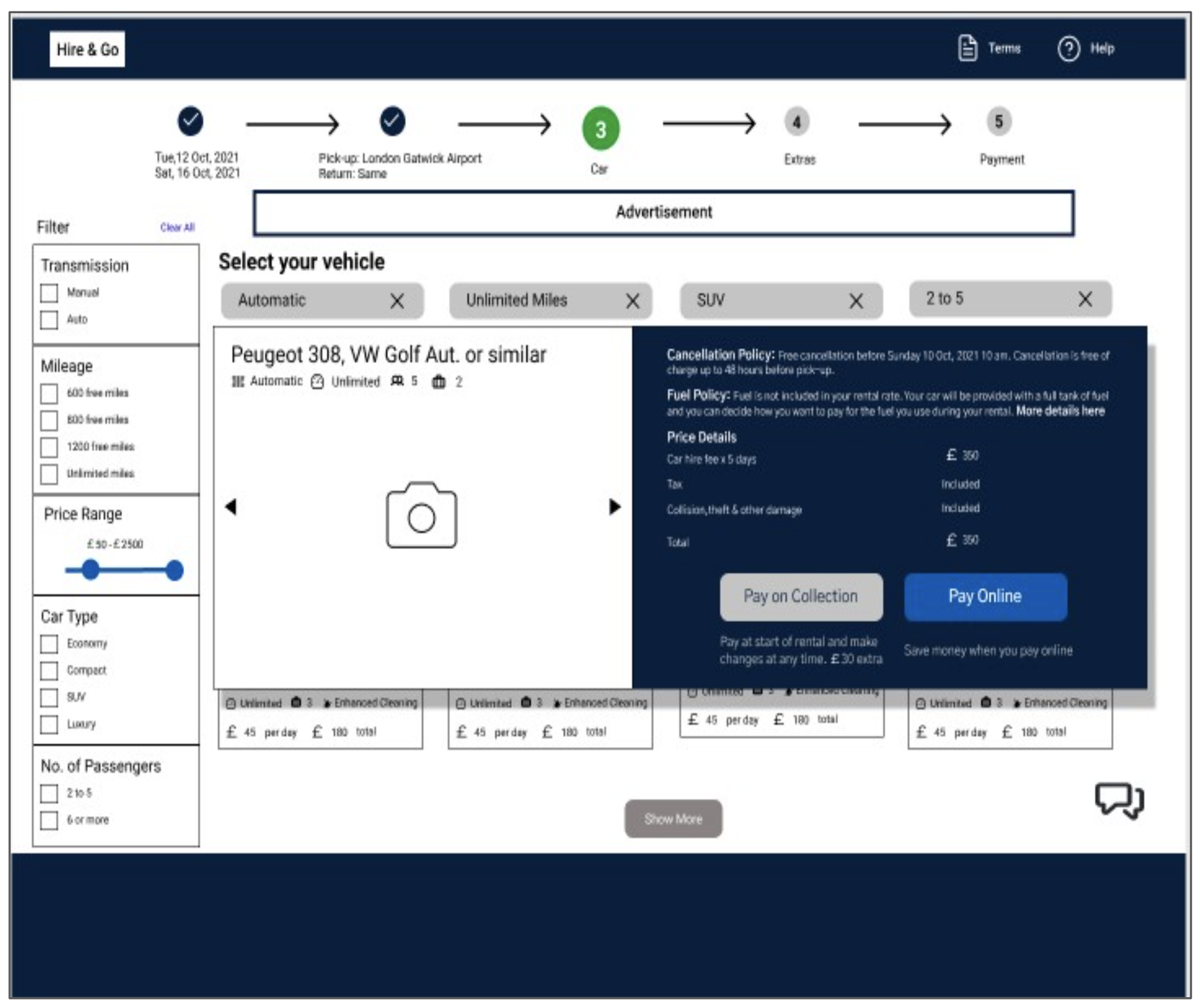
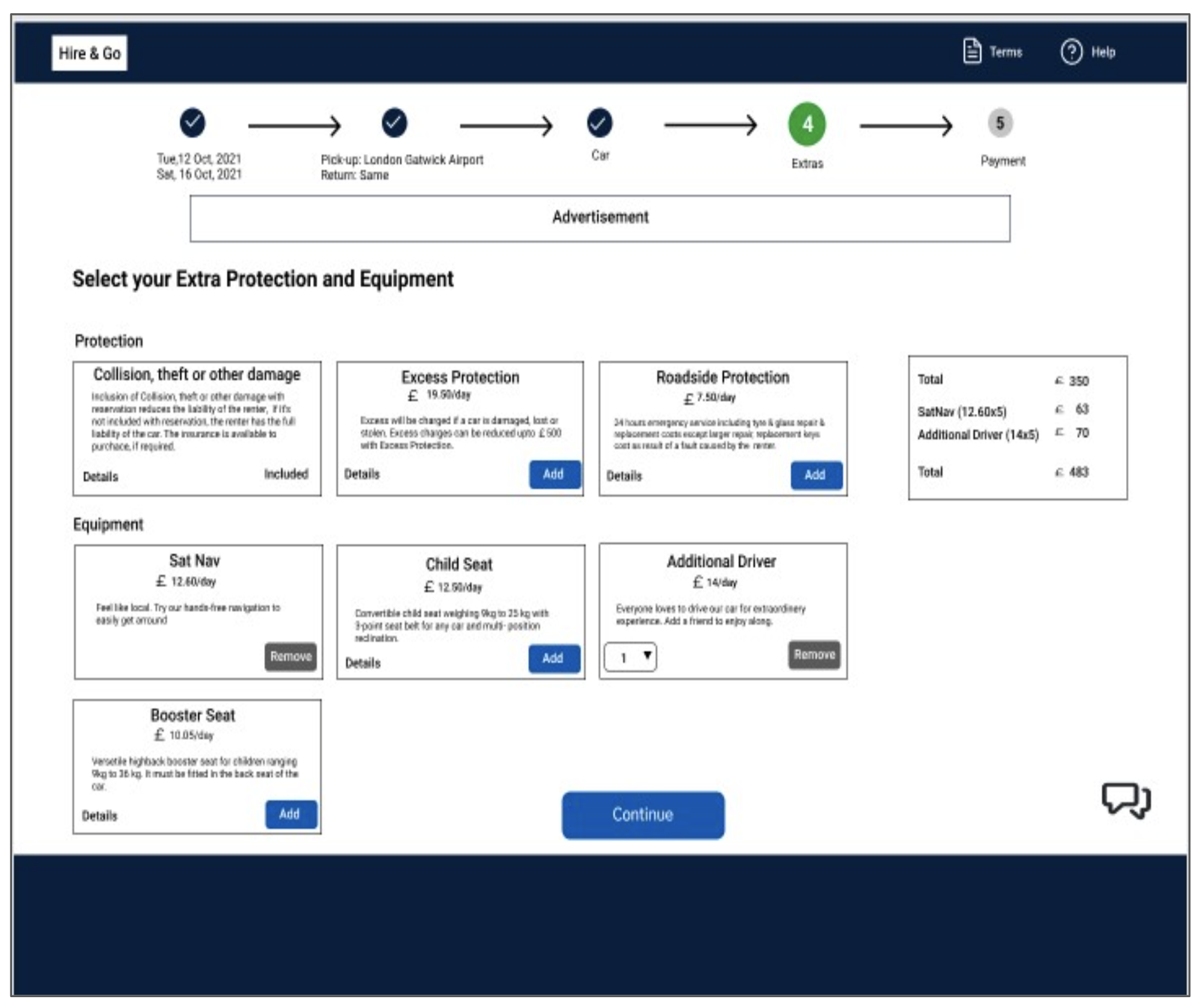
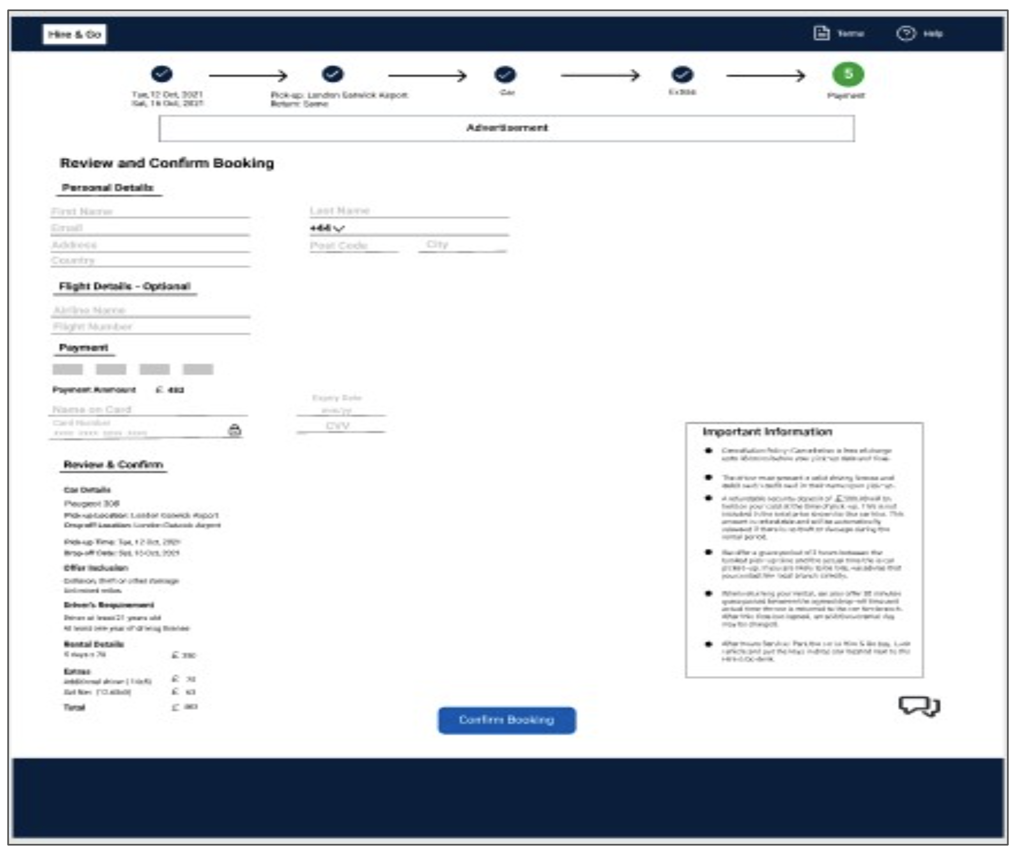
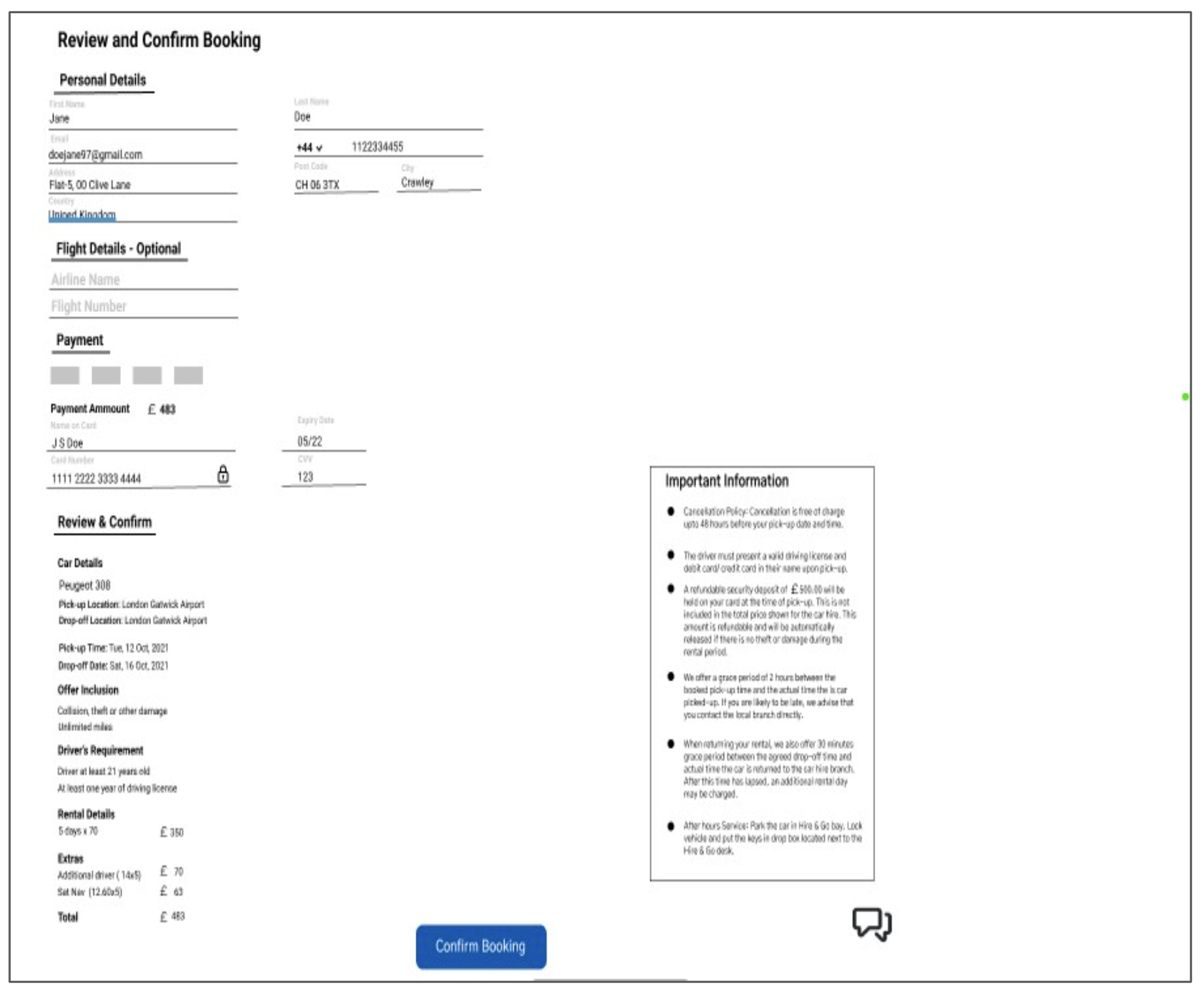
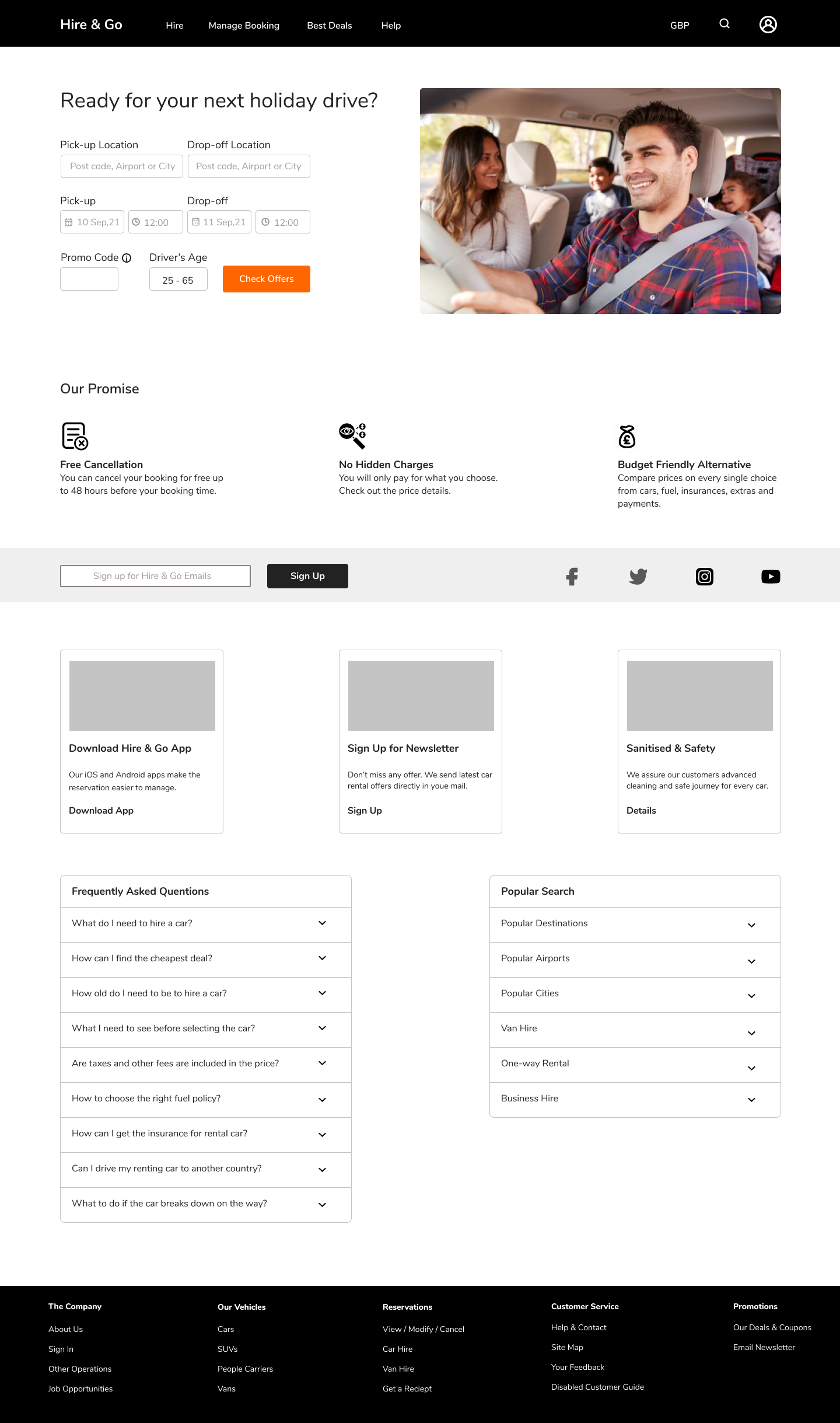
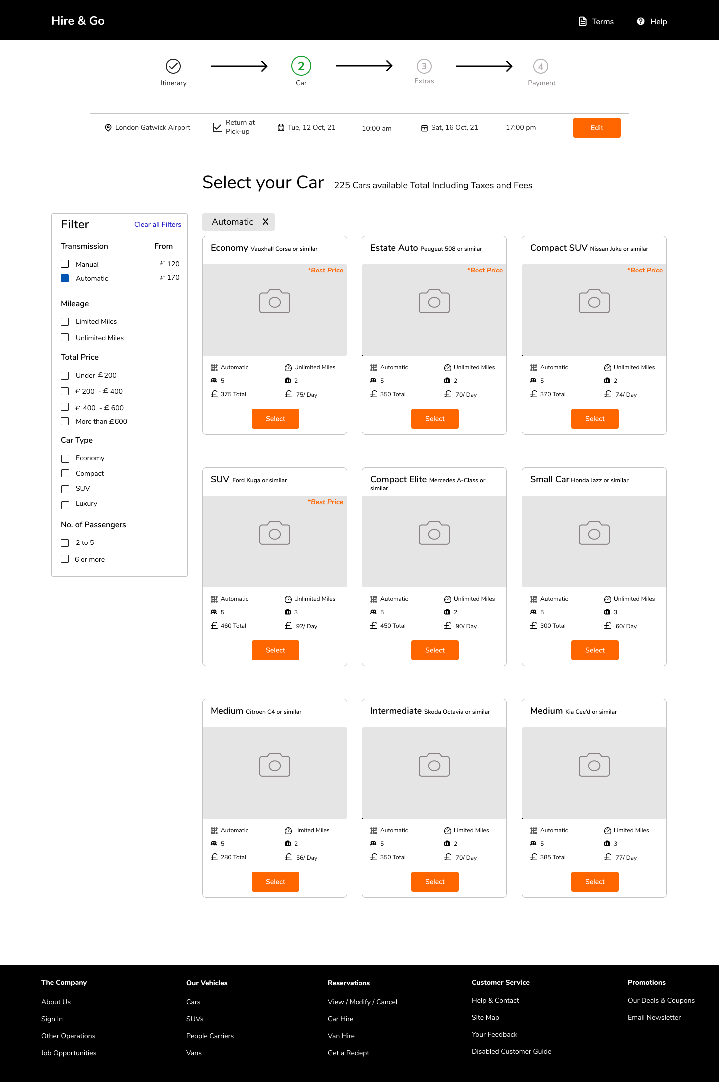
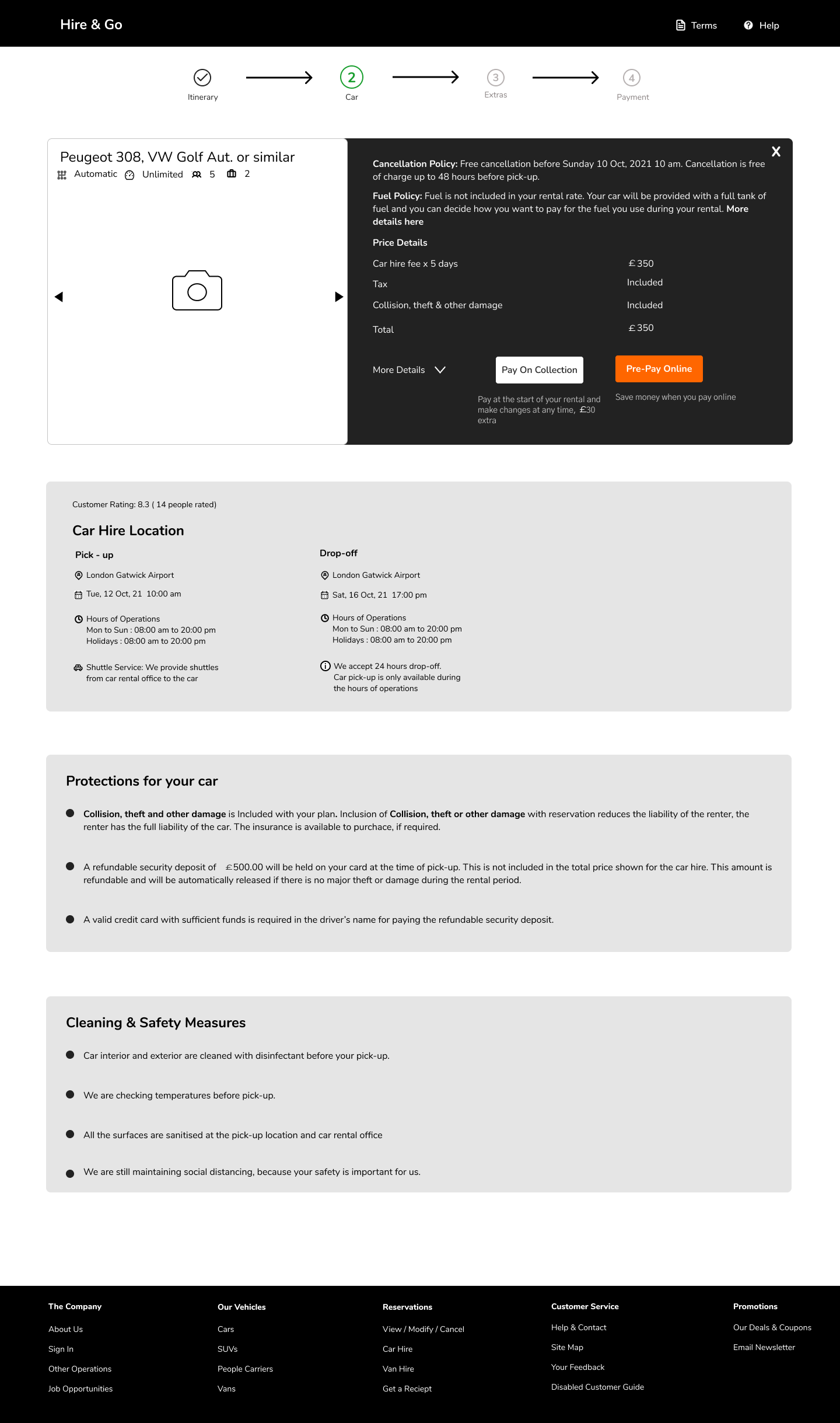
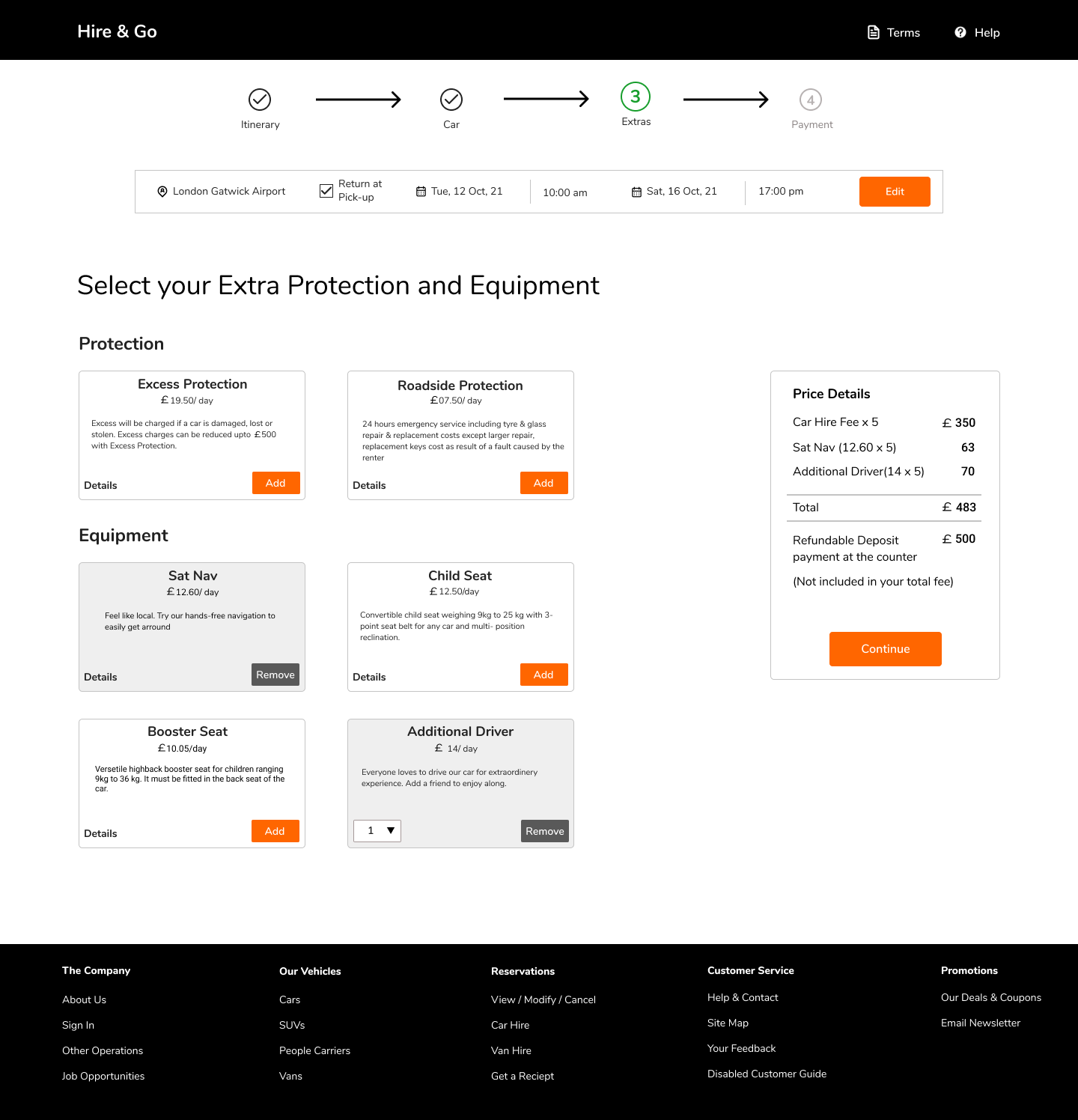
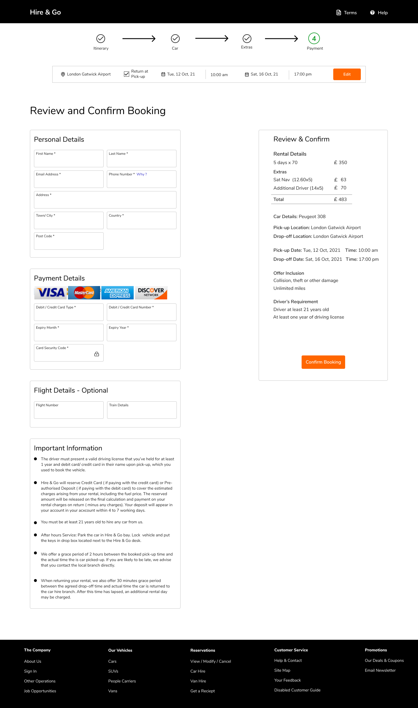
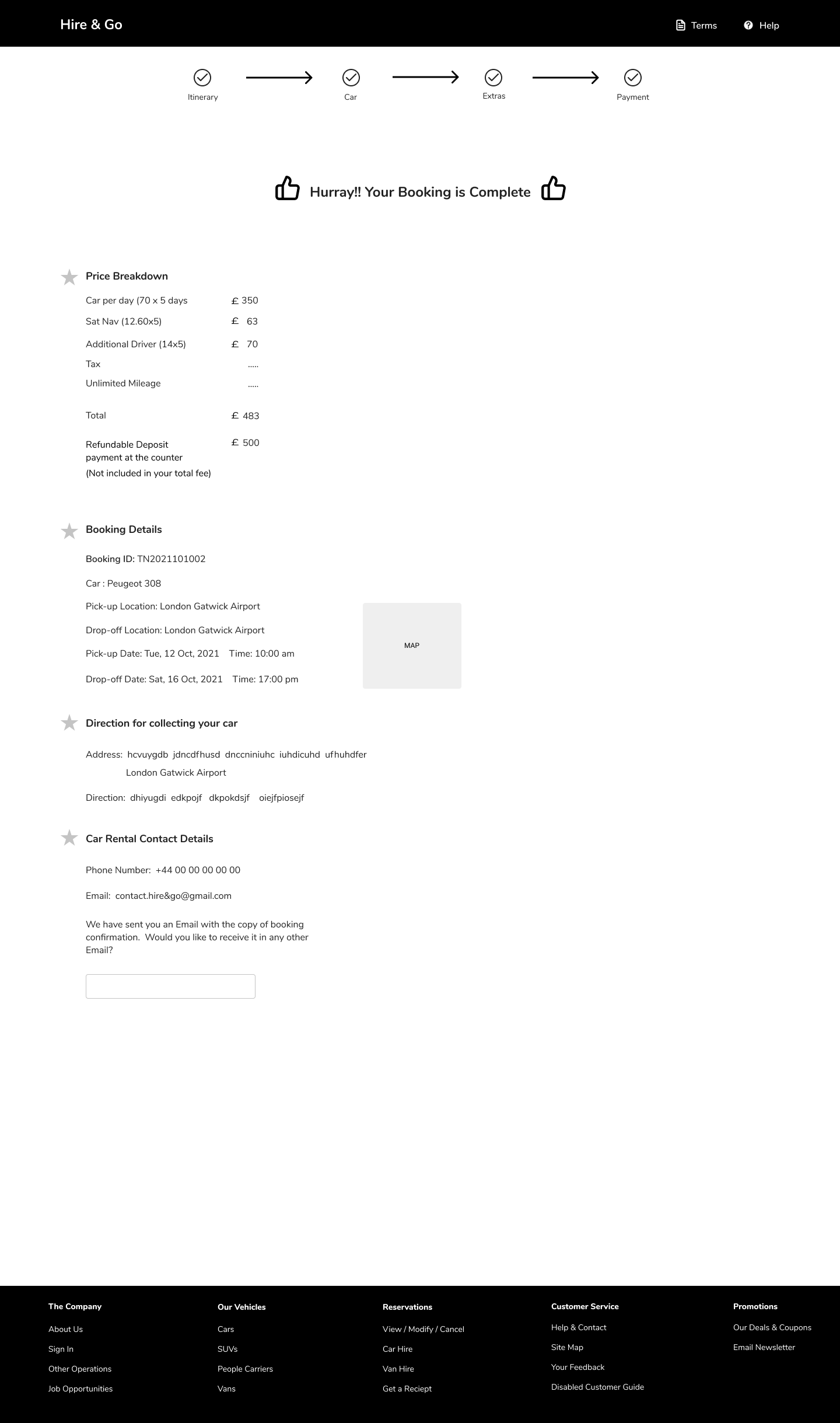
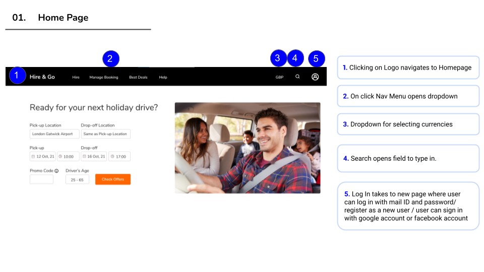
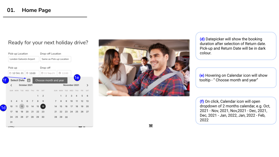
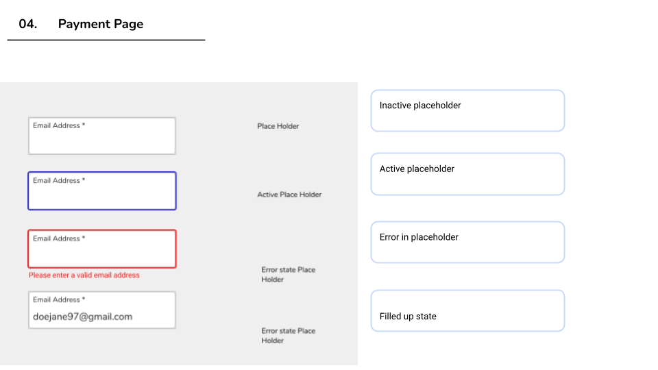
This is the final iteration of the mid-fidelity design of the screens. All the required information has presented in a way so that screens look clean and user get what they want to know for renting a car.
In this document I described how the booking process is going to work and instructions for each and every feature. In a real life situation I would deliver it to the UI Designer and to the Developers.
After usability tests with 5 users, I realised, the design is lacking aesthetic design aspects and users are getting confused and stuck on some of the steps.
The project was very interesting and provided ample opportunity to learn and develop my skills.
During the process:
Though I am quite happy with my UX design process and final iteration, but my design is still lacking some nice User Interface design. So in future I would like to add visual design aspects as well.
During this project I learnt interactive components and Auto layout in Figma and I’m hoping to use it more in my next design.


